Video guidelines
If you require any clarification on any of the points raised on this page, please contact us.
Overview
Every touchpoint, whether it’s face to face, print, online or video, has an impact on Experian’s brand. This page summarizes our video brand guidelines to ensure that we use this medium to create a positive brand experience for both internal and external audiences.
Title slides, speakers titles & closing frames
Core elements of title slides include our brand mark / logo, typography, and imagery.
Brand Mark / Logo
The Experian brand mark should appear on every intro slide, but its size and placement will be adjusted to accommodate any text. Further details on this can be found in the Brand Mark section.
Typography
Use Din Next as your font for video typography. We encourage you to purchase Din Next if you do not already have it. If you are unable to purchase, Arial is the approved system font. Further details on our Brand Font can be found in the Colour and Font sections.
Imagery
Video images should align with our brand guidelines. Further details of this can be found in the Photography section.
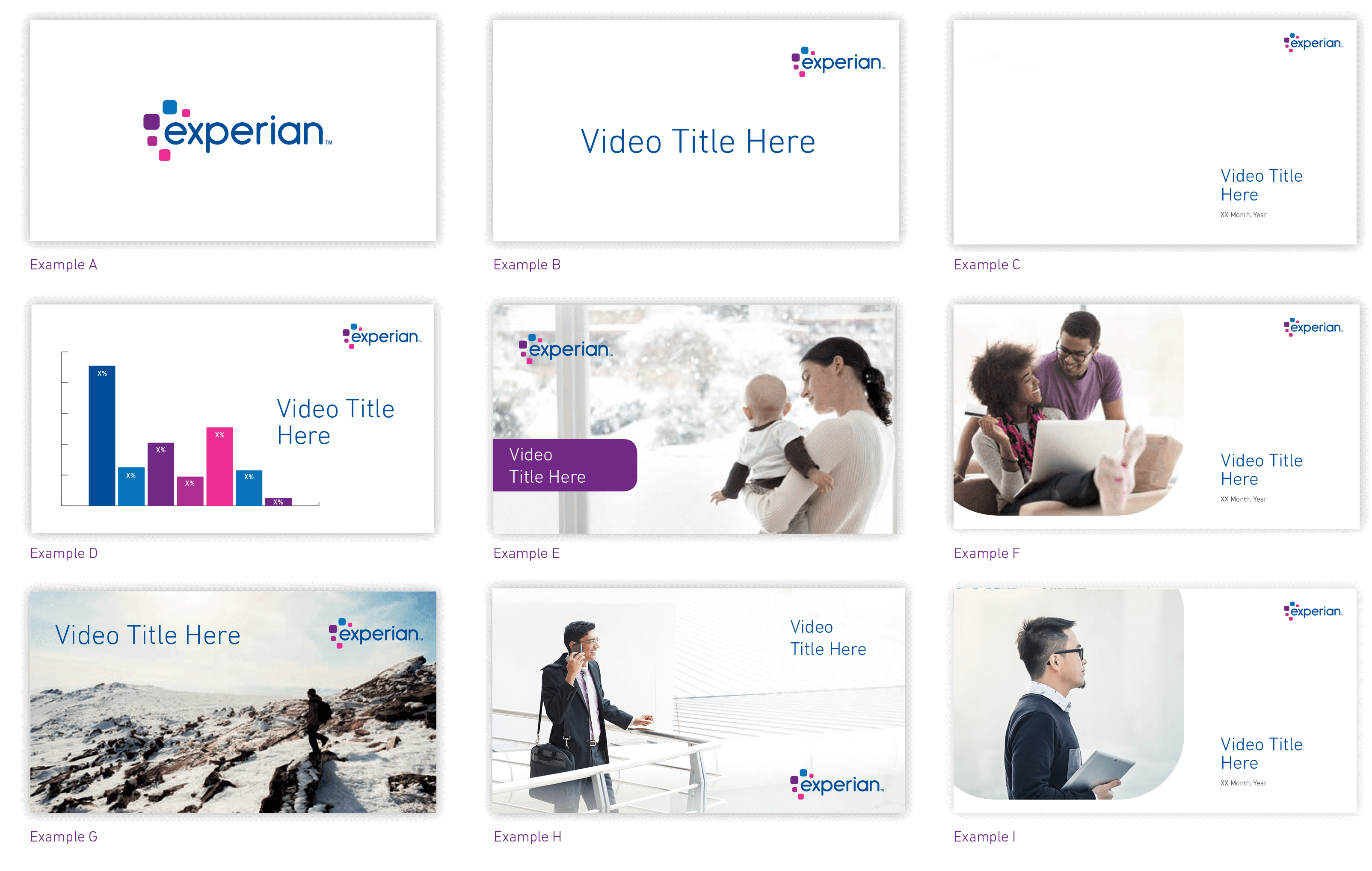
The below examples may provide some inspiration on how to use the brand elements to create animated title slides.
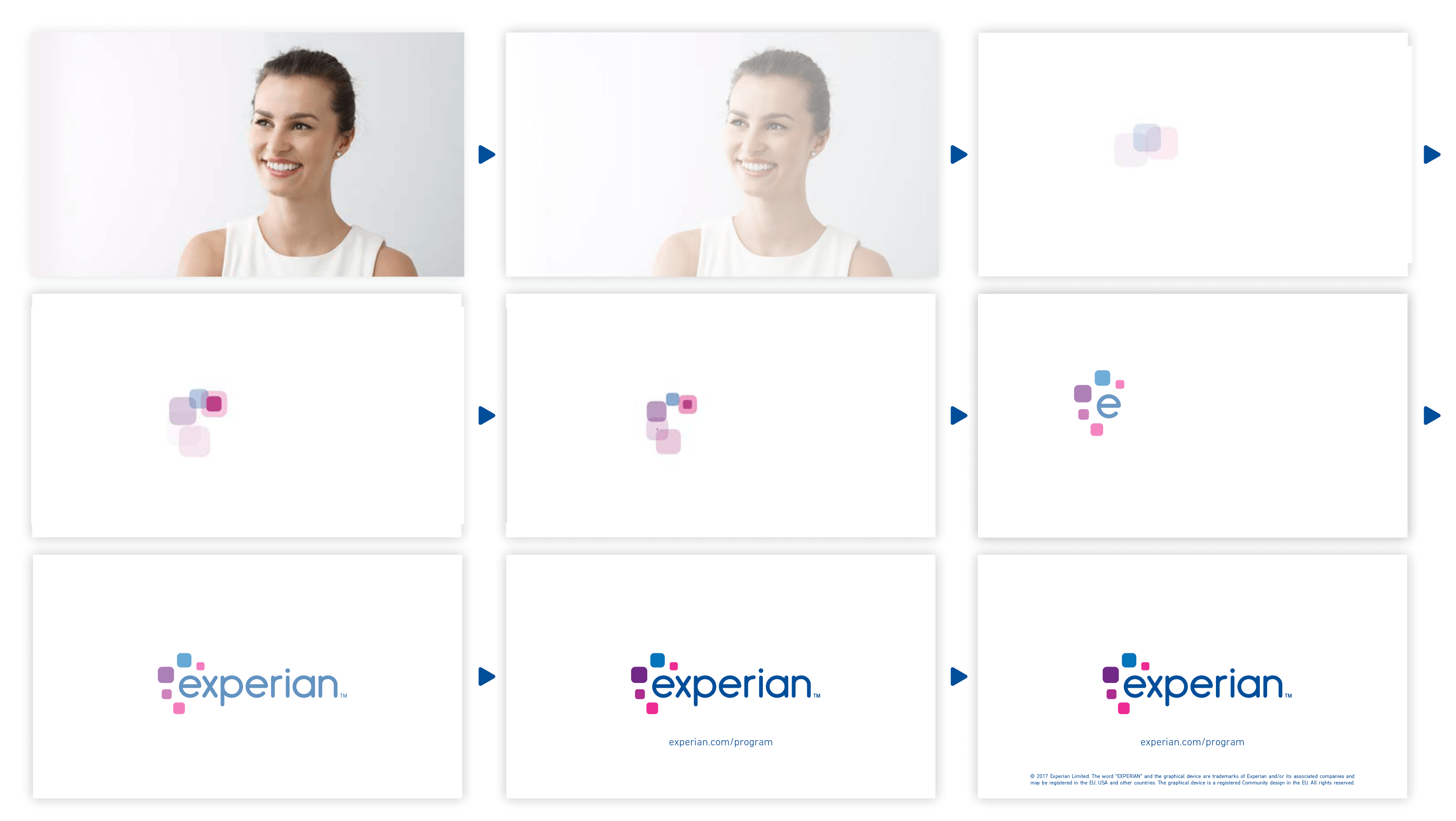
Example A shows a centered logo fading from right to left, the squircles expanding, fading and moving into a larger squircle featuring the opening image then the squircle expanding to full screen. You can create your own animation sequence as long as it follows the logo and imagery guidelines.
Static title slides can also be treated in a variety of ways. The examples show four different ways to utilize the new design.
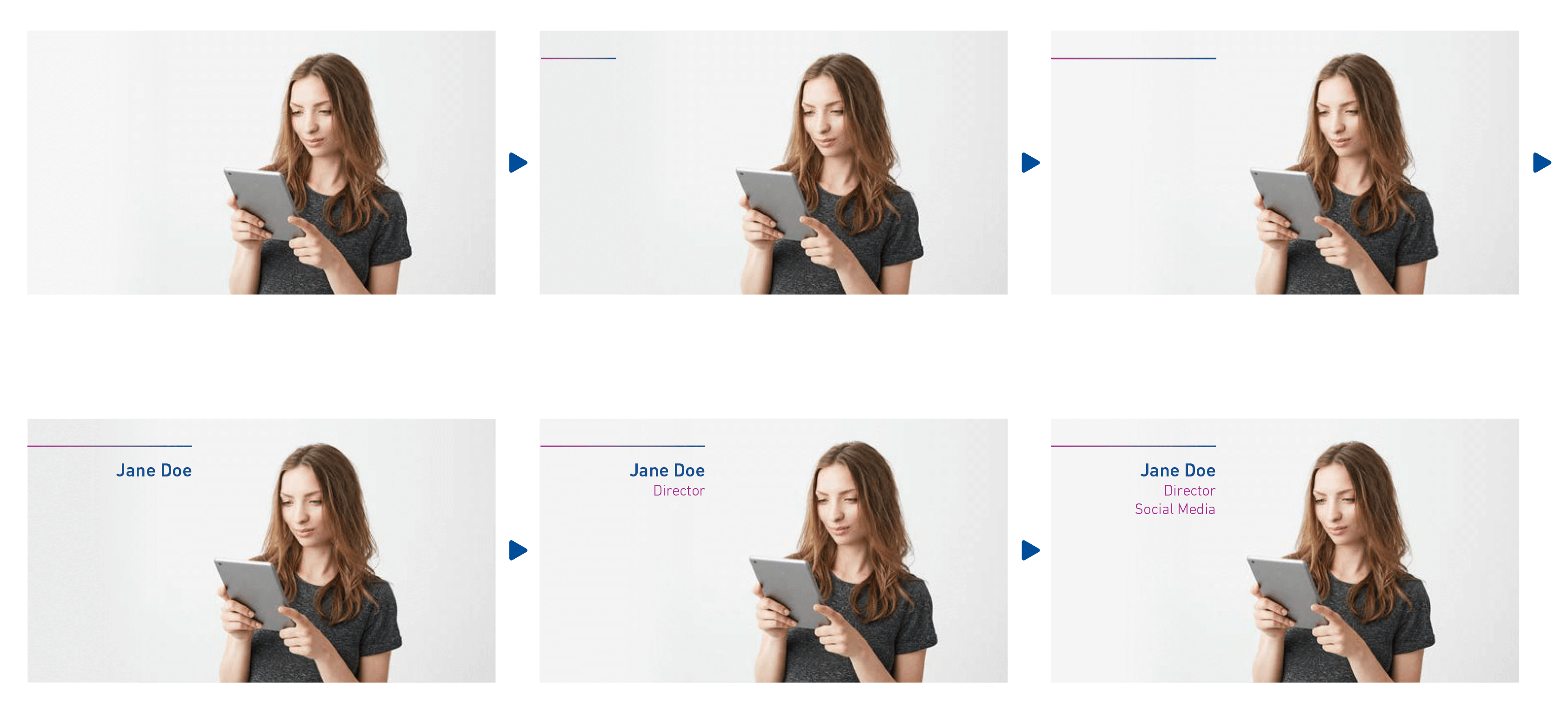
Speaker titles
Speaker titles are elements of an interview style video that introduce one or more people talking. Two design styles are provided here, along with suggestions on usage and duration.
Usage
Speaker titles should only be used upon first appearance of the speaker.
Duration on screen
(not including the build time) Title graphics can build into your shot in any way, however keep in mind the purpose of the title slide is to communicate information, not provide entertainment.
- Minimum duration: 1 second
- Average duration: 2 seconds
- Maximum duration: 3 seconds
Background
Speaker should be featured against a light coloured backdrop, preferably light grey or a complementary colour to the Experian brand colour palette. If a green screen is used, the suggested brand colours or neutral background should be applied. Speaker can be situated in front of an Experian logo branded wall, see example B2.
Design
Two options are available depending on the background. Example A is recommended for lighter or single colour backgrounds such as walls and backdrops. Example B is recommended for office or outdoor backgrounds. Example B2 shows a layout sample utilizing the Experian logo part of the background, as a wall mount or wall decal.
Camera positioning
Interviewee should be positioned off center, preferably not facing the camera. Distance the camera far enough away from your subject so you can see their waist. We want to be far enough away so you can get a sense of where the subject is in the environment, not so close up that we only see their face.
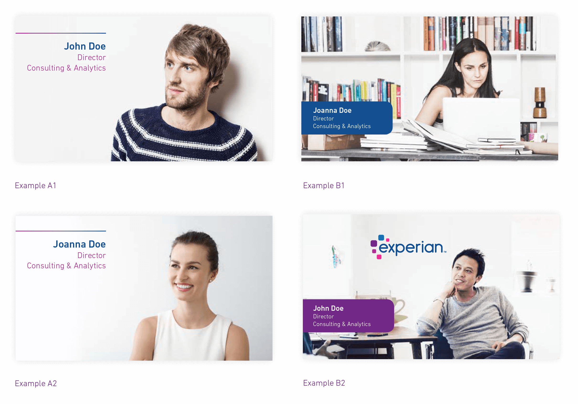
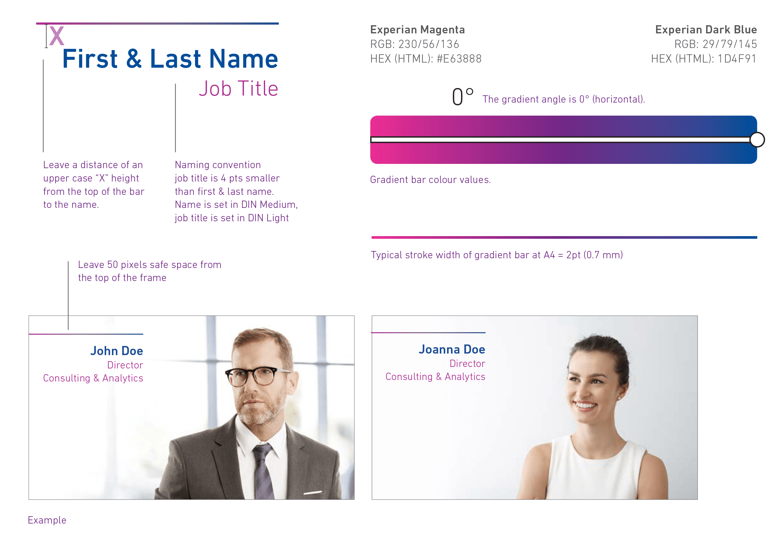
Example A specifics
Type is set in Din Next Medium and Light weights, text is flush right, with the first and last names 4 pts larger than job title.
Gradient/Solid Colour line
A gradient bar can add interest to the speaker titles but any of the Experian primary colours may be used if a solid line is preferred. Follow the guidelines here to properly set the gradient if you are using this approach.
Position on screen
We suggest they are placed in the top left-hand corner.
Define safe zone
Leave at least 50 pixels clear space from the frame top margin.
Text size for names and titles
Name is set in Din Next Medium, in the Experian Dark Blue, title is set in the Experian Raspberry, and is 4 pts smaller than the name.
Title graphics can build into your shot in any way, however keep in mind the purpose of the title slide is to communicate information, not provide entertainment. In this example the copy header line is drawn from left to right. The speaker’s full name and title appears from top to bottom.
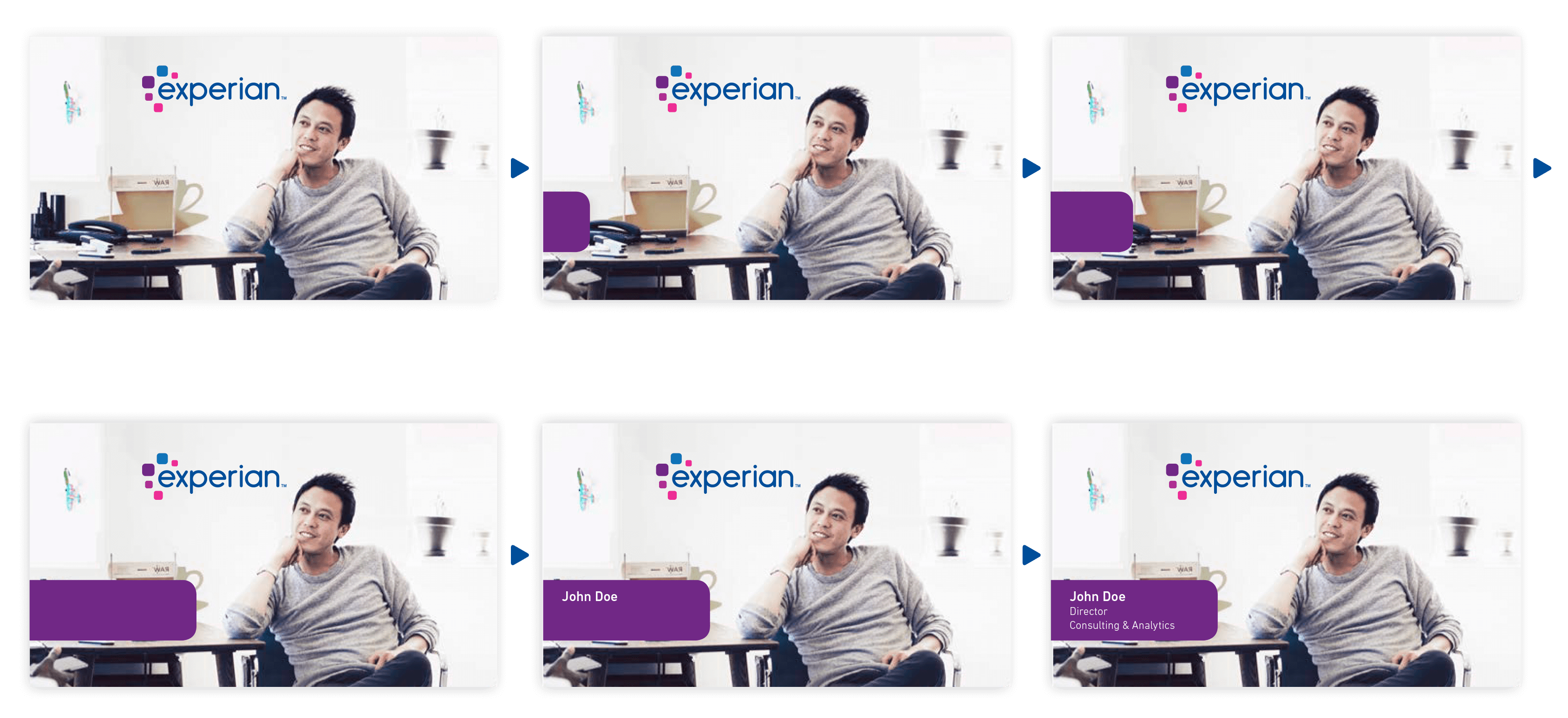
Example B specifics
Both are set in Din Next Medium, text is flush right, with the first and last names 4 pts larger than job title.
Squircle bar
Bleeding off the left side of the page, only the right corners are curved at 0.1 pt radius.
Position on screen
The position of the squircle bar can be on any part of the left or right side of the frame, keeping in mind it should not interfere with your subject, or the branding.
Define safe zone
Leave at least 50 pixels from the bottom of the frame. Leave at least 15–20 pixels distance around the type in the frame.
Text size for names and titles
Include font type & colour(s); First and last names are set in Din Next Medium, and titles are set in Din Next Light. First and last names are 4 pts larger than the titles.
Name and title bar move in from lower left corner.
Closing frame
As with the intro/title slide, specific guidelines also apply to the closing frame of your video.
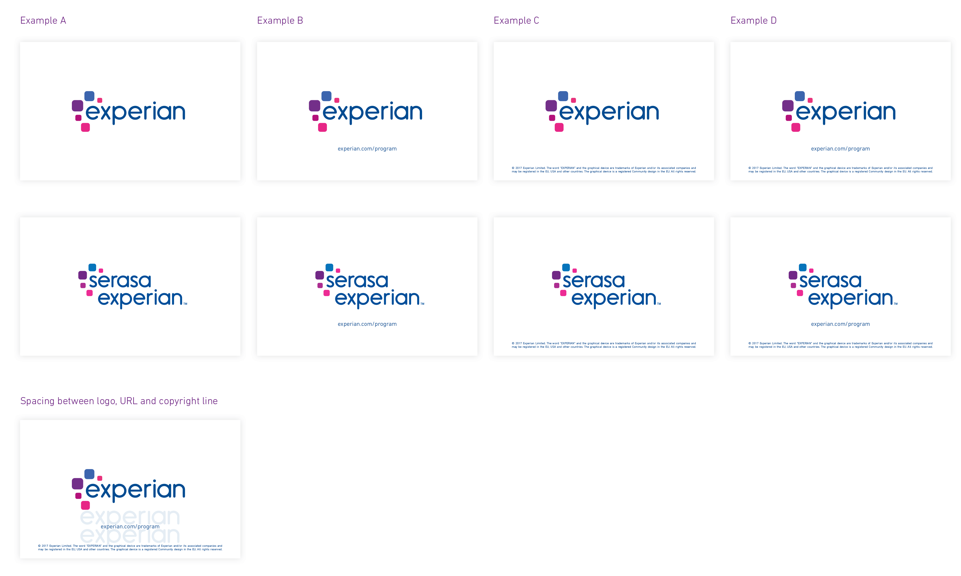
Logo only
If you’re showing the logo only, it should be centered with ample empty white space around it and placed on a bright white background.
Logo and call to action/website URL
If a website URL is required, text should be set in Din Next Light and centered below the logo. The point size should be based upon the size of the logo and be at least one Experian x-height away from the logo. See examples below.
Copyright line
All external-facing videos should include a copyright line. Check with the Business Unit you’re working with, to get the exact language. Example C shows the preferred copyright line placement using Din Next Light, center justified near the bottom of the frame.
Logo and call to action/web URL and copyright line
Example D shows the placement of a call to action and a copyright line. Follow the instructions above and reference this example for composition.
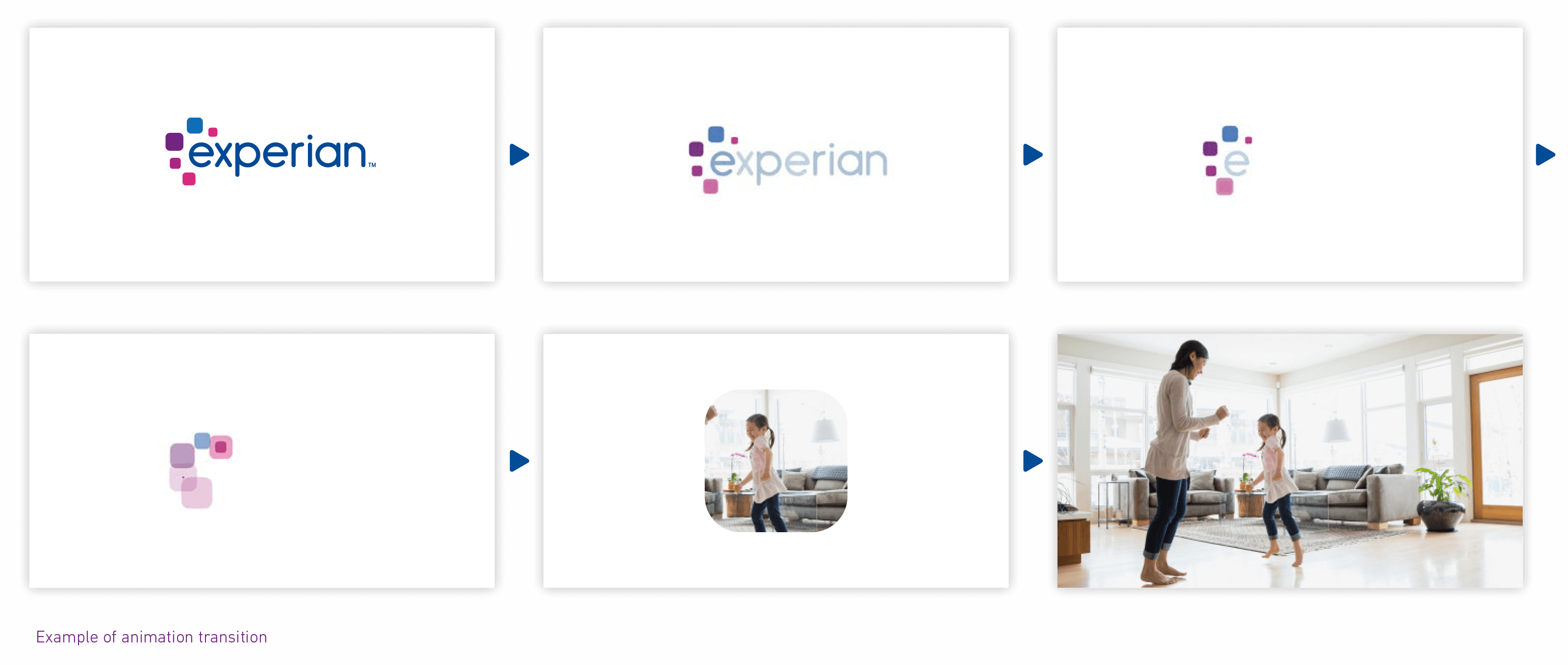
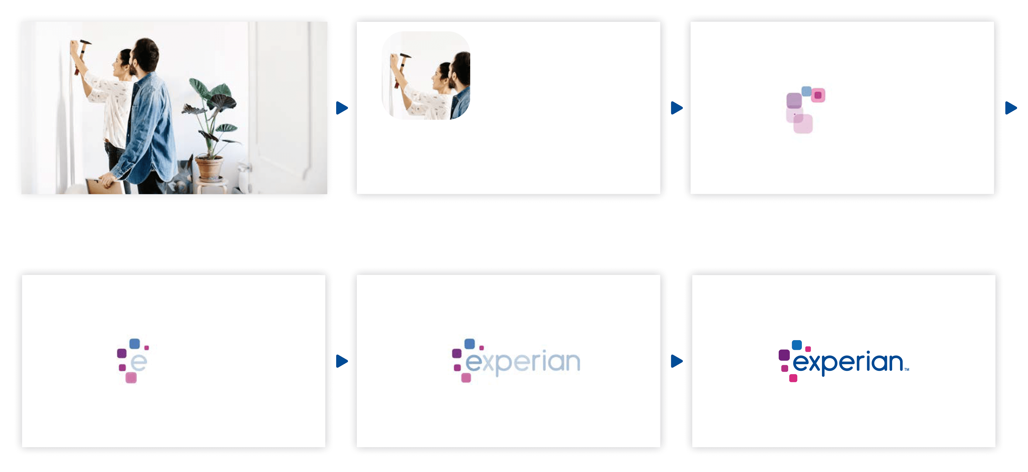
Transition to end frame
Scene fades out to a white canvas. Squircles animate like in the example shown here.
Call to action/website URL/ copyright line
These elements, if present, will appear on the page after the Experian logo finishes animating.
Transition to end frame
This closing frame example is the reverse of the opening treatment from the earlier example.
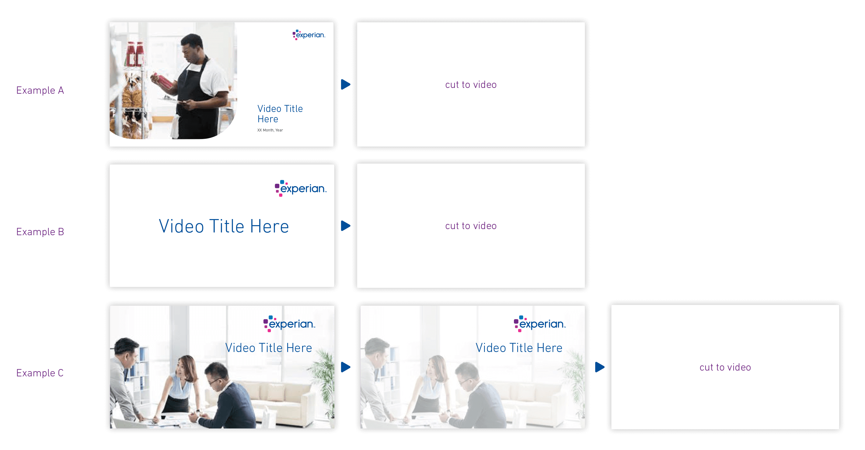
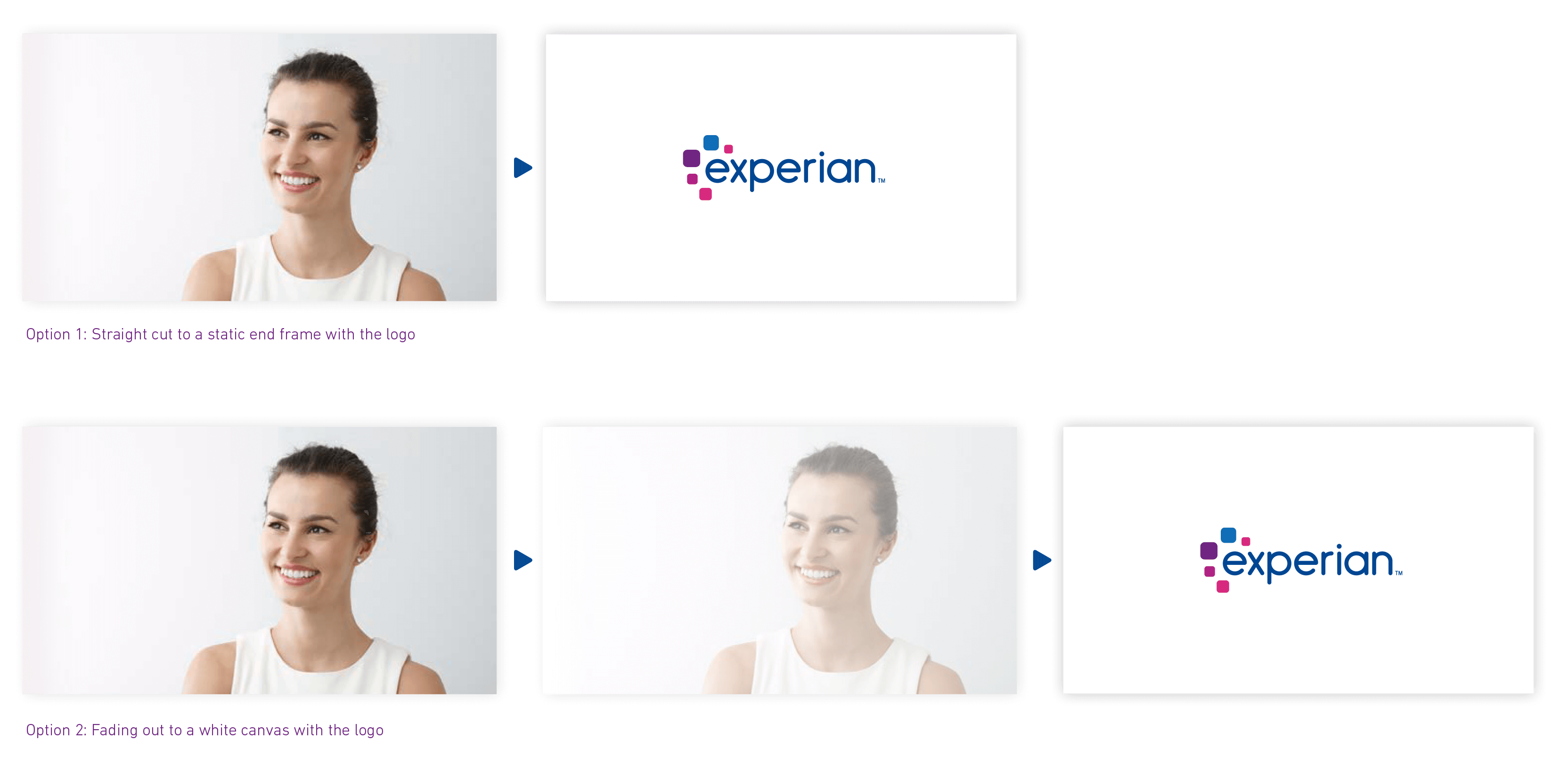
Transition to a static end frame
In situations where the budget doesn’t allow for additional animation, the transitions to the end frames could be simple cuts or fading out effects. See examples below for reference.
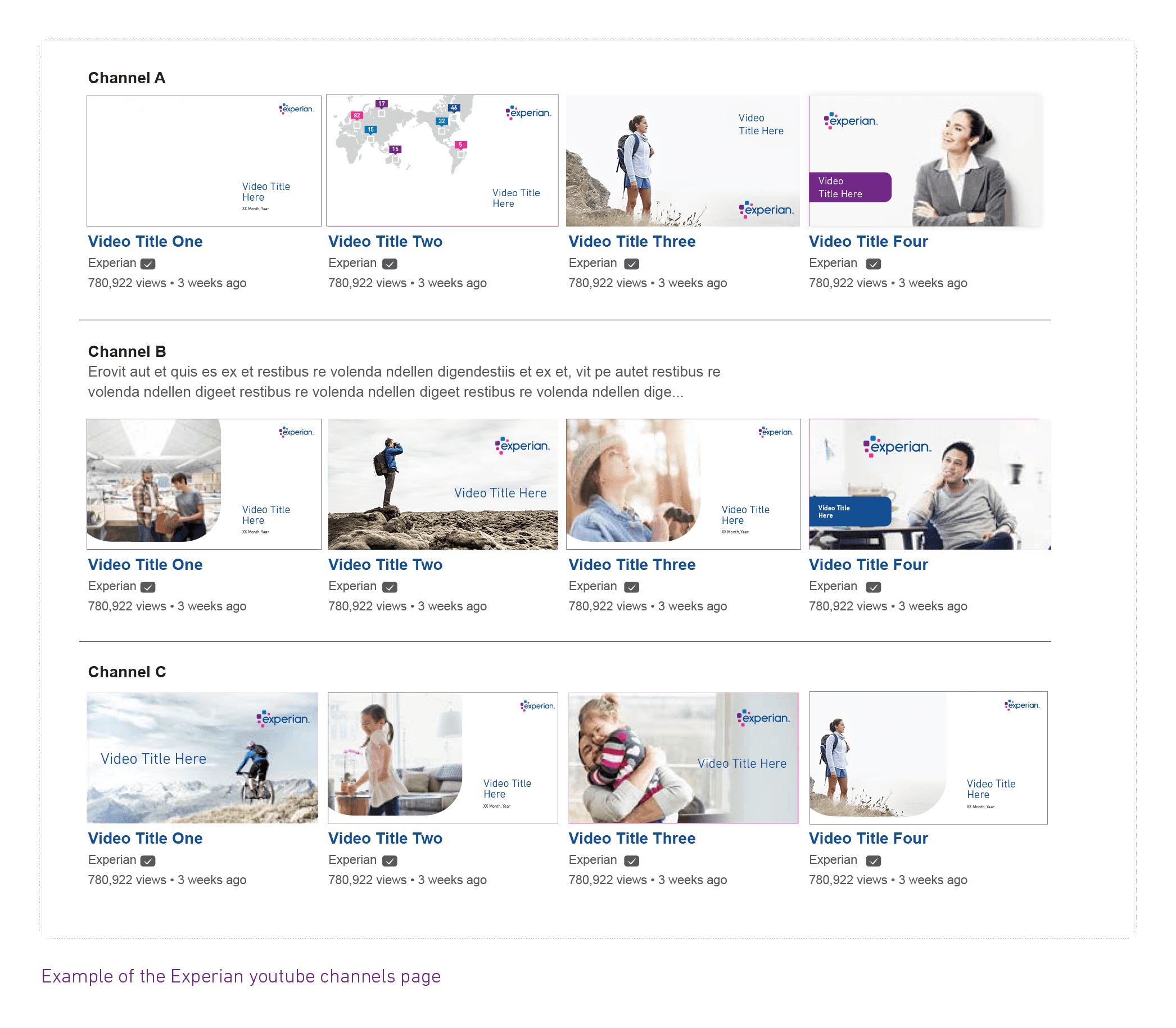
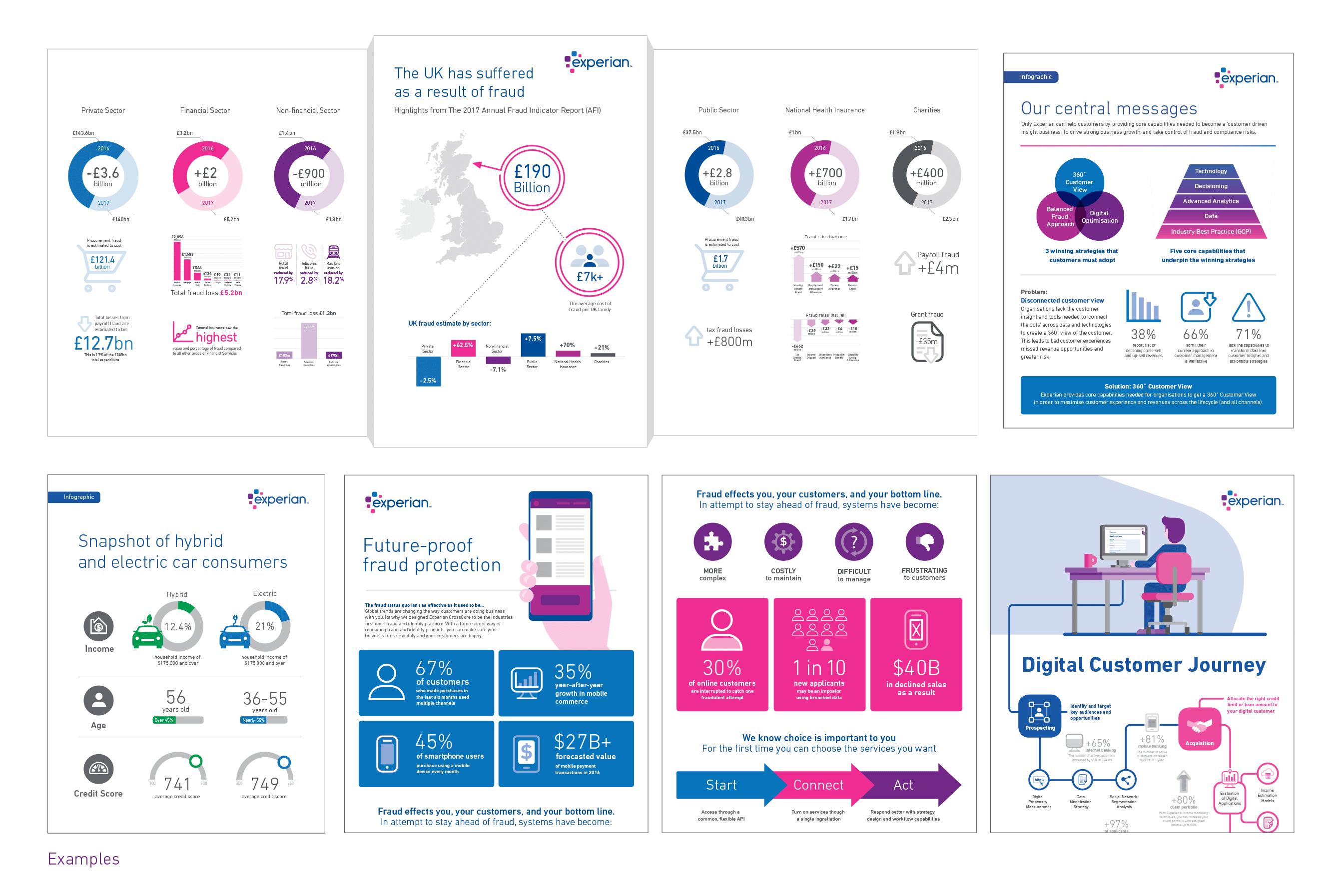
Featured images on social channels
In support of the branding and communication efforts of Experian, video display title card photos could be the title slides when available.
Motion graphics
Motion graphics allows you to combine several elements — such as typography, graphics, illustration, images — that you animate, or move, to tell your story.
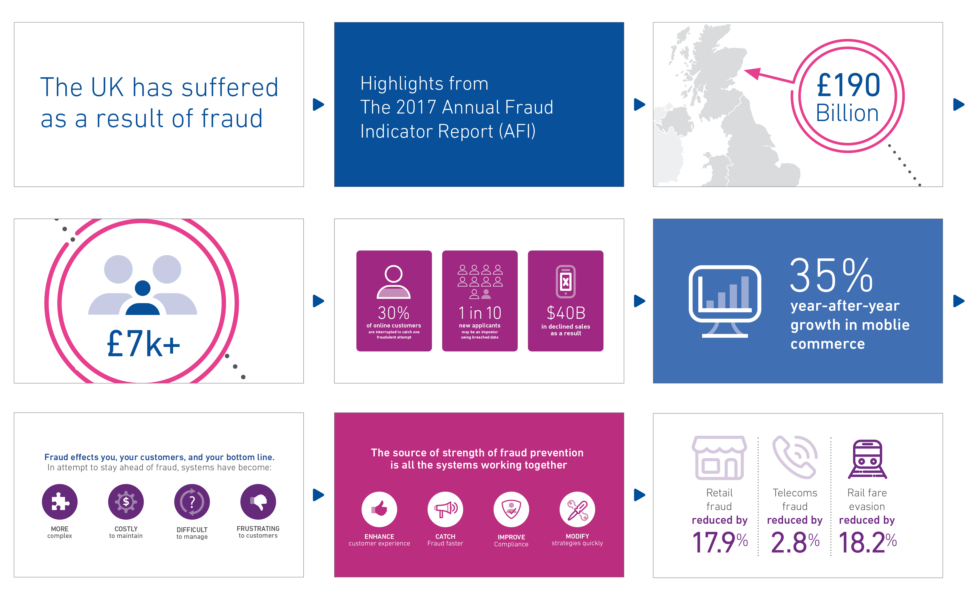
Here is an example of motion graphics that use type and icons.
Animation
Animation style
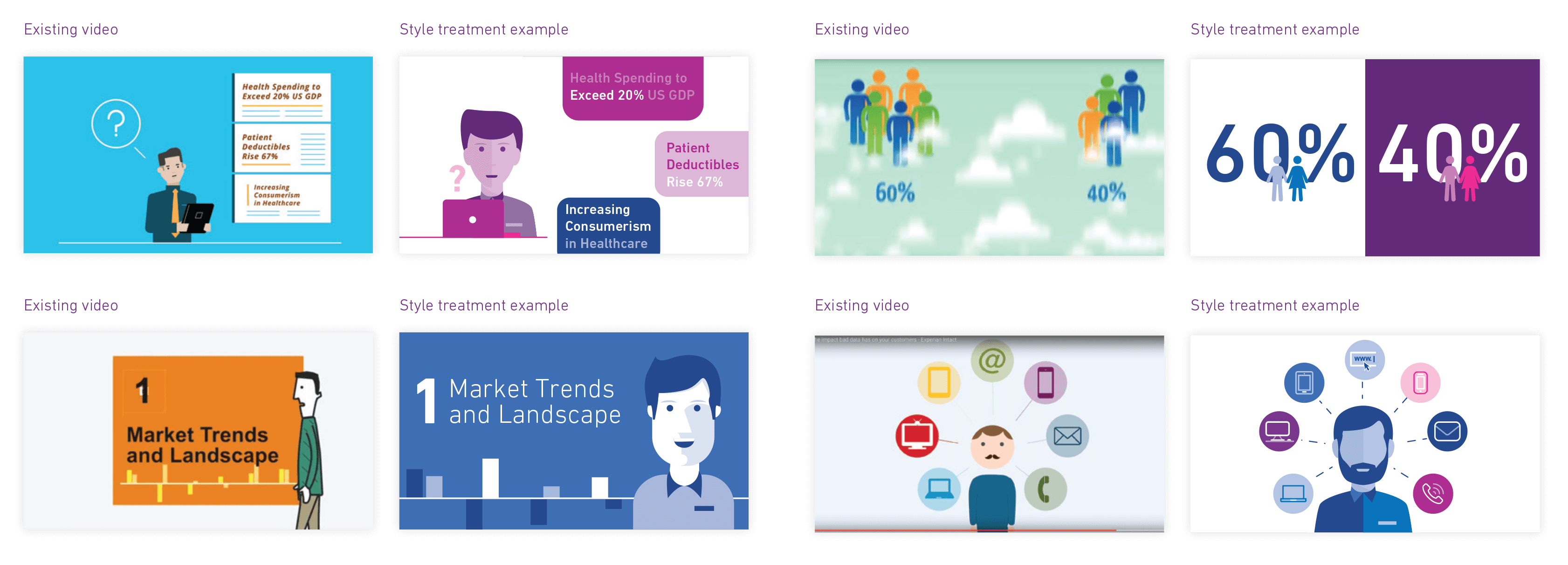
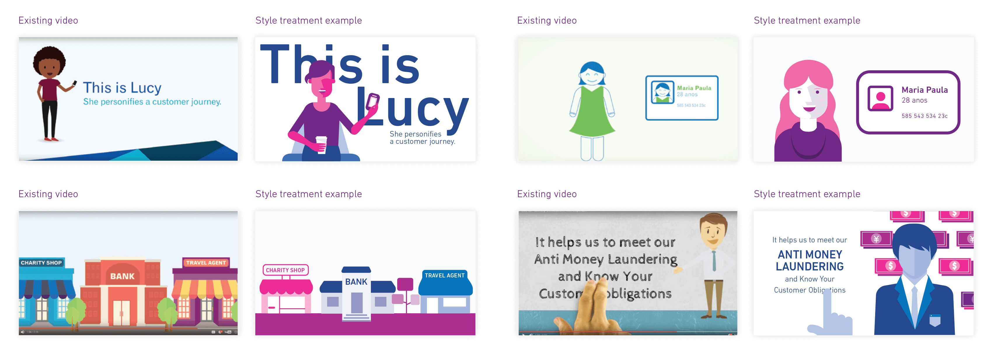
The next two sections show examples of animation style which are meant to guide you in the creation of animated videos. The style is inspired by the squircle shape and uses the primary colour palette as well as the icon library and inforgraphics.
When creating animated people, please make them two dimensional and in the colours of the aproved palette.
Use only the icons available in the Brand Asset Hub. If you need any new icons created, please contact the Brand Team.
Animation style
The goal is to keep the animation style simple, so the viewer can focus on the message. The color palette should be limited to the Experian primary colors and their tints, thus avoiding busy backgrounds that can be distracting.
The animations can enter screen any way you would like them to, however don’t make the effects so exaggerated they become more visually important than, or detract from the subject matter being discussed.
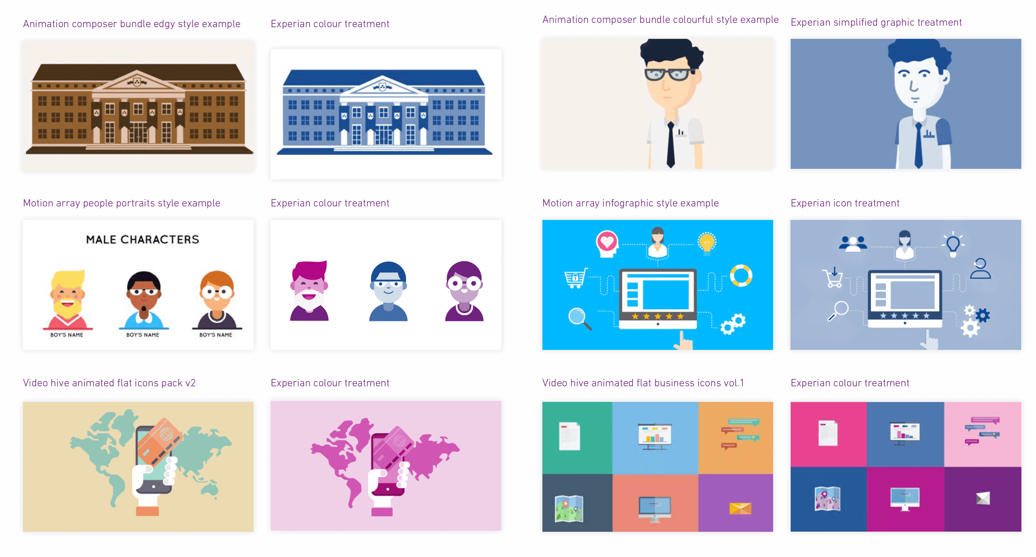
Animation plug-ins and templates can be used for your project when your budget is limited to using stock motion and graphics. Some of the plug-ins may come with extension packs containing shapes and other graphic elements. If you are working with these libraries and are not sure if the style is within the Experian brand, use the examples in this guide to help you select what styles may be appropriate. When in doubt, please consult with the brand team.
The examples to the right below show some online asset libraries available to purchase for After Effects along with suggestions on how to make these look part of the Experian brand.
Some of the assets in various libraries may require very little editing, such as colour, some may require further edits to simplify the shapes.
When working on a project, unless you are confident with editing shapes, try to keep one style throughout, and not combine styles from different libraries.
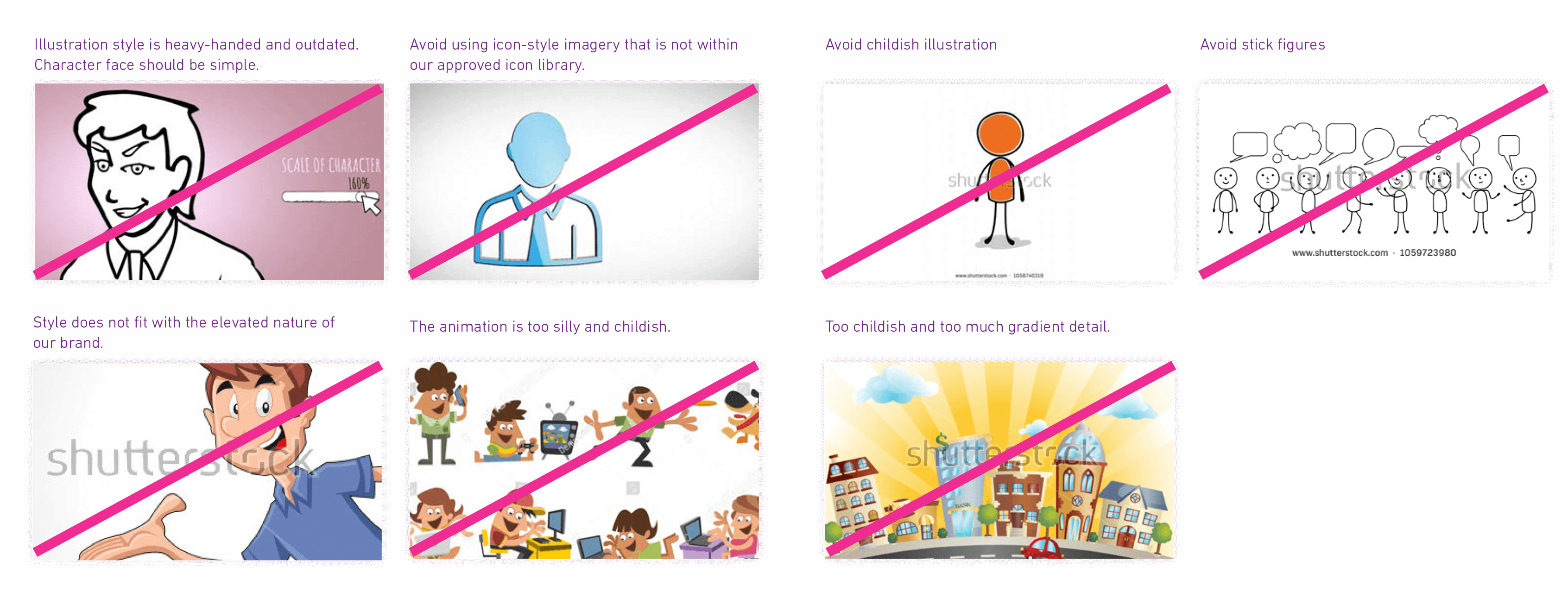
The examples below show the style of illustration that does not work with the Experian brand, even if the colours are shifted to the brand colours.
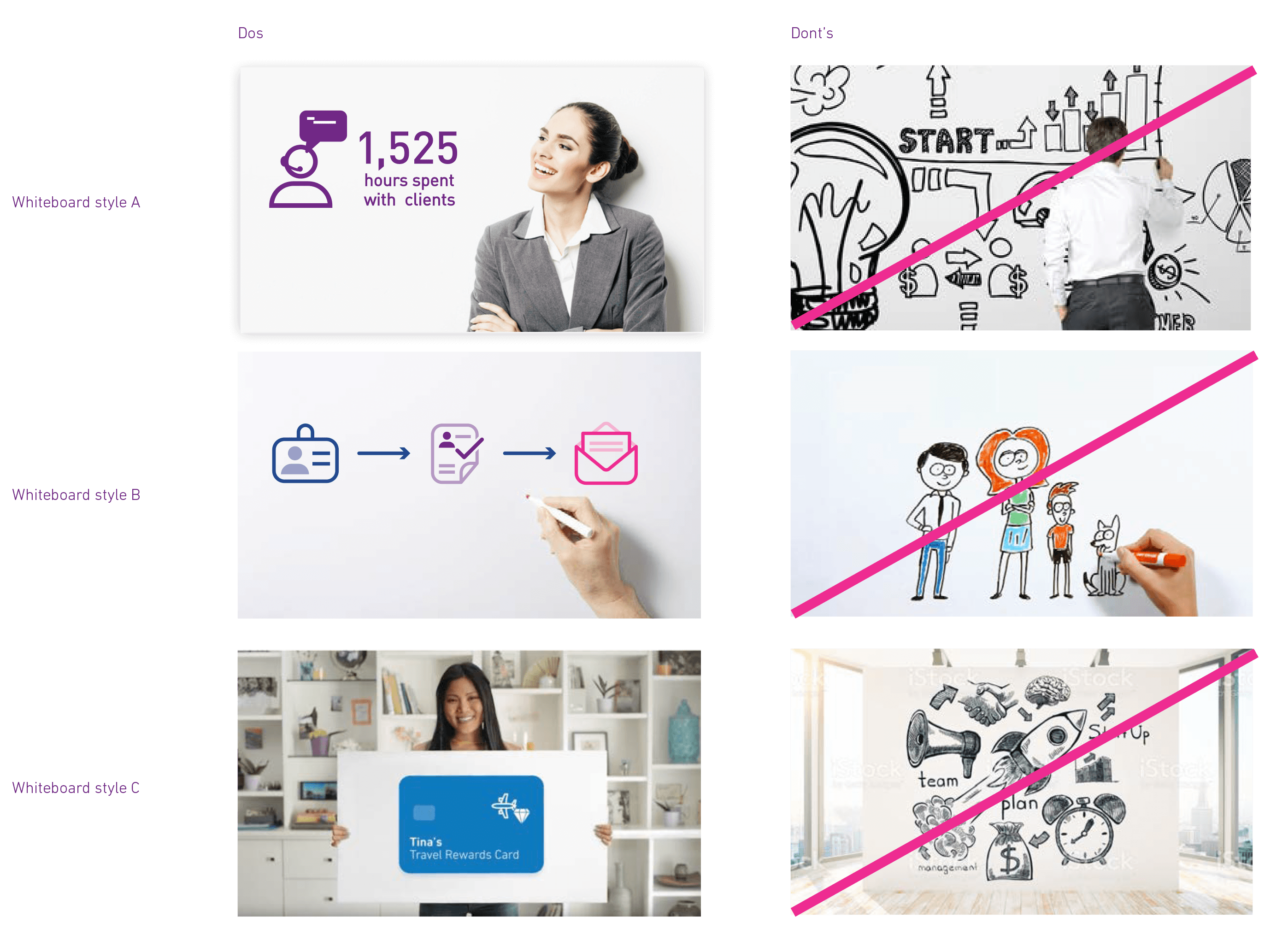
The use of white board animation is fine as long as it matches the style and colours established by the brand guidelines.
The examples shown here are existing brand icons taken from the Brand Asset Hub.
Motion graphics & animation
Colour overview
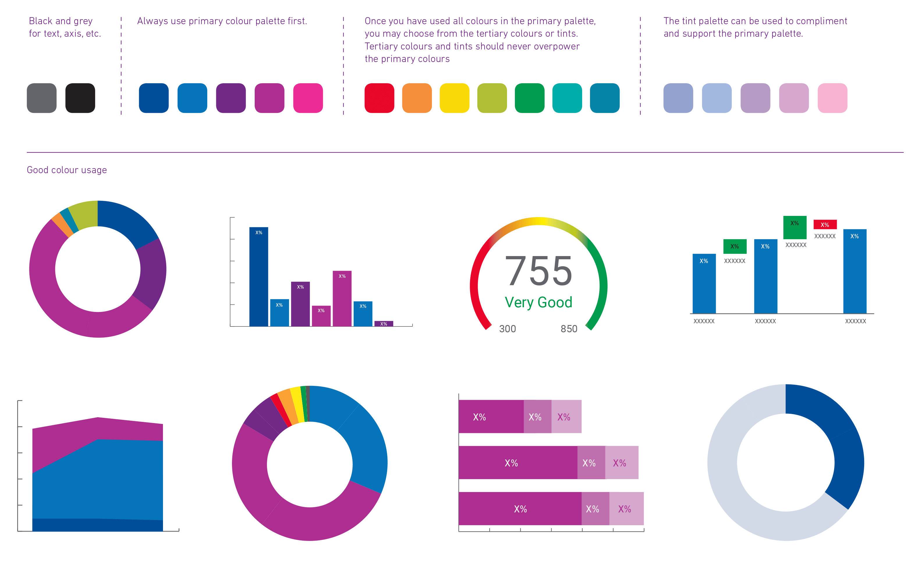
All our charts and diagrams should have a distinctive Experian look and feel. To achieve this, our primary colour palette should be used predominantly. Examples below show the colour use, and hierarchy. Details of our Brand Colours can be found in the Colours & Fonts sections.
Always start with our primary palette. Our tertiary palette can be used for complex charts, graphs or for special call outs on infographics. Our support palette can be used if the tertiary colour palette has been exhausted, or to support or emphasize the primary palette.
Our Grey (80% tint of black), Experian Dark Blue and Experian Purple may be used for chart headings and for chart structural elements such as axes and text.
Standardise the use of colour among a set of charts and graphs to ensure consistency.
Style overview
We aim to keep our information graphics simple and straightforward by keeping them flat and minimising the number of elements. Graphics can appear on screen however you like but avoid the use of unnecessary special effects as the information in the graphic should be most important, not the graphic effect.
Here are a few principles to follow when creating information graphics:
- Where possible, our infographics should appear on a white or corporate coloured background.
- Always start with our primary palette. Our tertiary palette can be used for complex charts, graphs or for special call outs on infographics. Our support palette can be used if the tertiary colour palette has been exhausted, or to support or emphasize the primary palette.
- Our Grey (80% tint of black), Experian Dark Blue and Experian Purple may be used for chart headings and for chart structural elements such as axes and text.
- Our primary typeface Din Next (or system font Arial) should be used for titles, annotations, key, and source information.
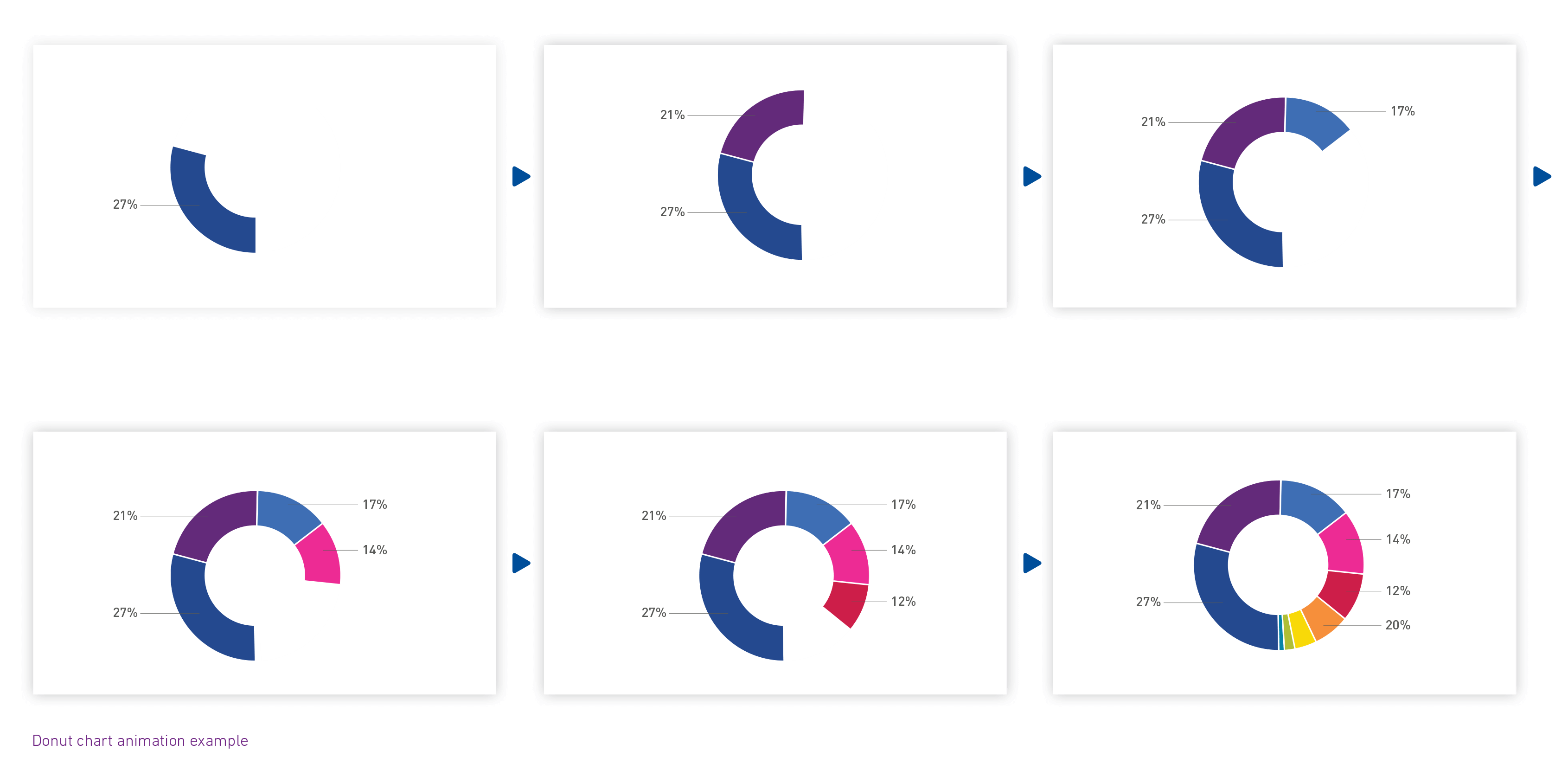
- Feel free to use the extensive icon library found on the Brand Asset Hub to create infographics in motion.
This example shows how you might animate a donut chart. Keep the motion simple so the effect does not overshadow what you’re trying to communicate.
Infographics can be used in a live footage video, as part of the background or foreground. They should be ideally placed on a lighter background, and have plenty of empty space around them.
Graphics can appear on screen however you like but avoid the use of unnecessary special effects as the information in the graphic should be most important, not the graphic effect.

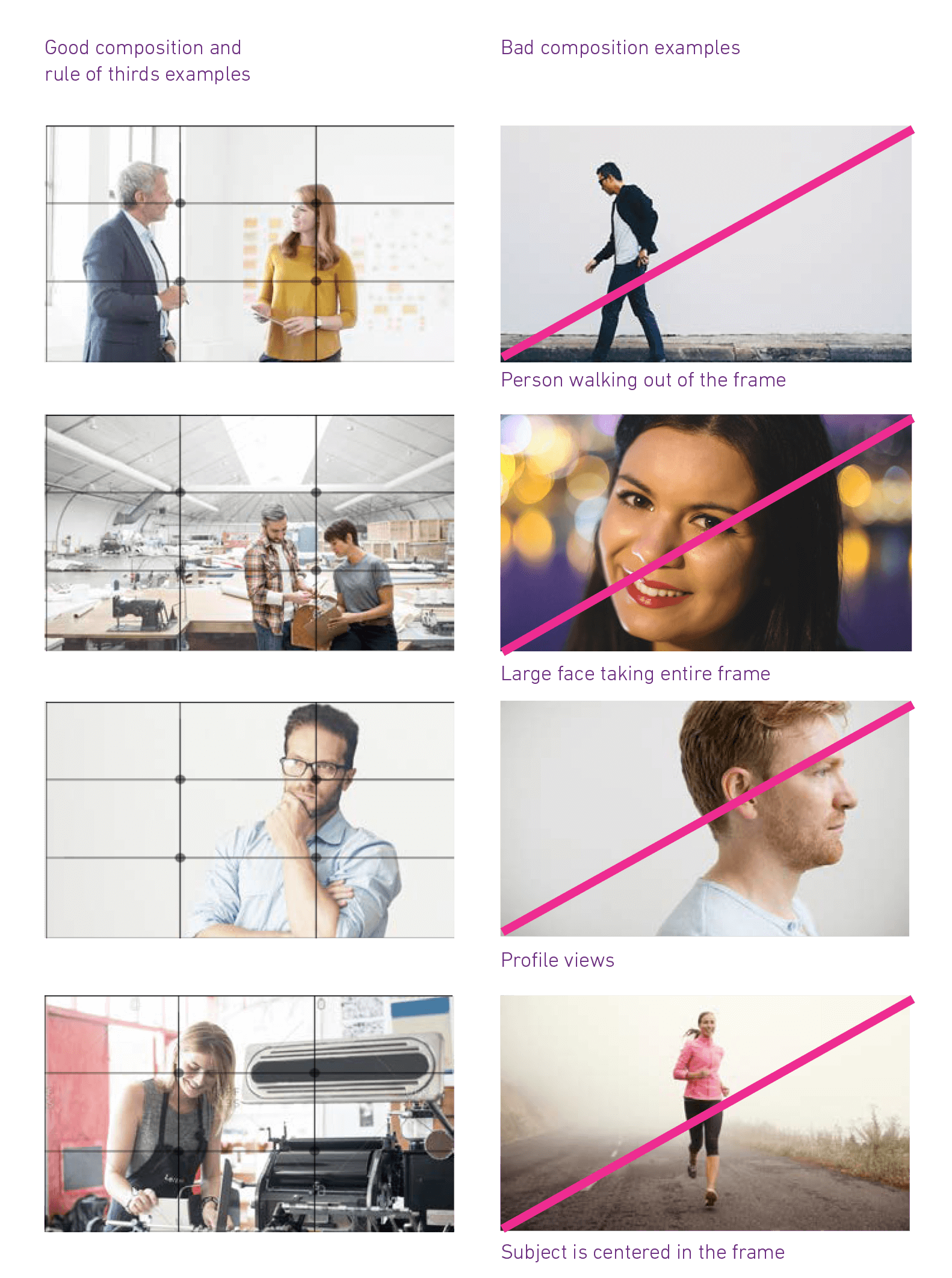
Composition
Our videos should be as aesthetically pleasing as possible so please try to ensure good composition, use of background, lighting, and exposure.
Shooting style and formats
When shooting indoors, take time to ensure you have the appropriate lighting, camera, and background setup to showcase your subjects.
- Scene setup/background
You need to find the balance between showing the environment, but keeping it simple enough to maintain the focus on your subjects. Pay attention to any objects that are strongly drawing your eye away from the subjects. Sometimes you’ll need to do a bit of “redecorating” to get things just right for the image. Simple coloured backgrounds are encouraged. In circumstances where a clean light coloured background is not available, do your best to replicate the guidelines. This may need to be done in post.
- Lighting
- Window light/natural light is preferred and every window can be used for front lighting, side lighting, or backlighting.
- Generally speaking, north and south facing windows will have the best light throughout the day.
- The closer you are to the window, the more light you will have to use and work with.
- Limit the light sources. When natural and artificial are used at the same time, you’re mixing sources, and that can make it impossible to properly white balance the image. This is especially bad when both light sources are hitting your subject. If you cannot avoid a mixed lighting situation, do your best to achieve daylight by adding gels to your artificial light and adjusting your white balance.
- If for some reason you are not able to use window light to illuminate the subject, you can use open hallways or doorways to simulate a situation of open shade. Have the subject sit close to the edge of the doorway and face the light.
- Artificial lighting
- We recommend working around natural light sources whenever possible because it most closely represents our brand look. We also recognize there are times when natural light sources are not an option. In this circumstance, try to mimic the effect of natural light altering the white balance and adding gels to your light source
- to most closely achieve a daylight effect, which is 5600k.

Shooting outdoors poses its own set of challenges: you have to contend with external conditions, such as the weather, noise and other distracting elements. Shooting outdoors requires careful planning, to maximize your chances of a successful outdoors shoot.
- Scene setup/background
Place subject against a light coloured background that is not distracting. Subject can face the camera or look at an angle. Avoid dark coloured walls. Most of your shots will include background elements that are part of the location where you’re shooting. Make sure the background of your shot doesn’t draw your viewer’s attention from your main subject. You might also be able to put the background out of focus by decreasing the depth of field in your shot. - Lighting
- Avoid mixed light situations where possible. (EX: tungsten interview light w/sunlight in background) Match your lighting scheme to the look of the rest of your shots.
- Try to position camera and subject with the sun behind the subject.
- Avoid using the sun as a harsh backlight.
- Consider using a reflector to enhance outdoor lighting.
- Avoid busy backgrounds that are too dark.

Length
The maximum recommended length for video features is between one and three minutes. Most external and social media videos should be within this length range. Some videos can exceed three minutes. These are mostly internal: financial updates, employee programs, business unit quarterly updates, etc. For videos that are longer than three minutes, special consideration should be given to developing a structure and format that encourages users to continue on through the video segment.
Web videos
As a general rule of thumb, we recommend that you limit your video to a maximum of 10MB per minute and ensure that you encode your video for Internet Streaming (“Fast Start”) so your video will begin playing almost immediately.
Resolution
All video elements including text should be legible at a minimum 400 x 300 resolution. This is to ensure readability on mobile devices. Landscape (16:9 aspect ratio) is recommended for all video.
Music
Like video, music can evoke all types of emotions, and it has the ability to set the tone and pace of your video.
Sometimes we’ll have the perfect song in mind when developing a video, but most of the time we research music after the video is complete, locating a tune that fits the mood. We often use services like Premiumbeat.com, Tunefruit, or Audiojungle that have thousands of options for $100 or less.
Using stock footage
There will be times where we will not be able to produce our own video content and we will need to use stock footage. It may be that there are times when this stock footage is edited within specifically shot footage too.
When doing this, please remember that the video should still look to capture genuine, candid moments in people’s lives where they are active and unposed. The overall look and feel should be light, bright and uncluttered to create a smart and contemporary style.
If stock footage is used, ensure the visual metaphors are subtle and the look and feel of clips chosen is as close as possible to primary imagery, which should be natural, bright and optimistic.
In line with photography guidelines, don’t use clichéd visual metaphors, but use of brand literal representations or more conceptual stock footage depending on the need.
Don’t use dark and negative themes and settings; avoid any clips which use cartoons, clip art, photo montage or CGI, staged or contrived scenes, and where possible, use footage where the subjects are active and/or engaging. Remember to select clips which have an overall optimistic feeling even if the subject matter is difficult.
When editing stock with specifically shot footage, please ensure transitions are as clean and smooth as possible and a similar treatment and shooting style is used where possible.
This is a library of stock footage taken from a number of Experian offices and this can all be found on the Brand Asset Hub.
Other stock footage needs to be purchased in order for us to have the legal right to use it. Never use found footage or video you have pulled off the internet as we do not have rights to use that content for marketing purposes. If you have any questions about purchasing stock footage, please speak with the brand team, or your legal team for additional guidance.
