Colour
Colour is a key part of our visual identity. It helps create a consistent and recognisable look across everything we do, both in print and online. Use these guidelines to apply our colours clearly and confidently.
Colour is a key part of our visual identity. It helps create a consistent and recognisable look across everything we do, both in print and online. Use these guidelines to apply our colours clearly and confidently.
This simple, yet distinctive palette of colours makes us stand out and plays a critical part in what makes us look and feel different.
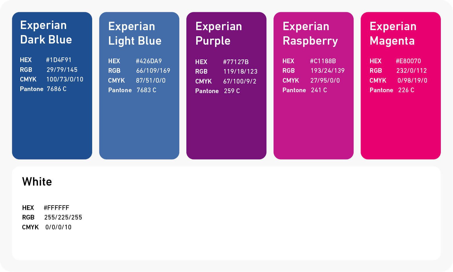
Blue is a core brand colour. It is used in the Experian wordmark and acts as a consistent thread running through all of our brand material. A selection of warm purple, raspberry and magenta tones also plays an important part in our palette and should be used generously across our brand communications.
White is an essential element of our brand. In compositions and layouts, the deliberate, generous use of white space provides a sense of calm and confidence and a canvas against which the other brand colours have greater impact.
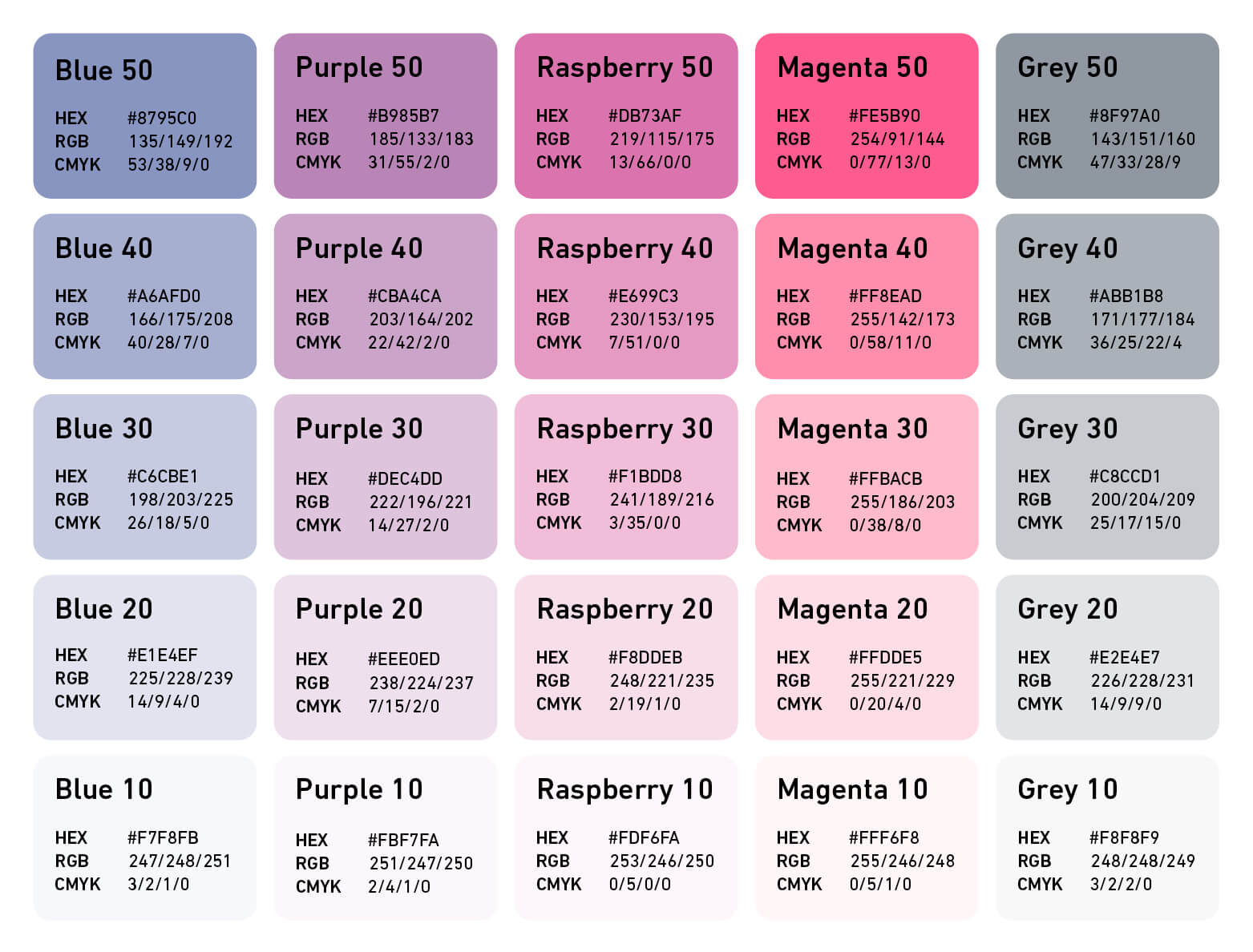
Our support colours are not tints, they are all solid independent colours.
Our support colours should be used to highlight, complement and enhance our Primary colours.
Support colours can be used in combination with solid Primary colours to create a tone-on-tone effect or to create hiearchy or depth, or when you want to be more subtle with colour.
Please consider whether the support colour palette meets accessibility standards for your audience.
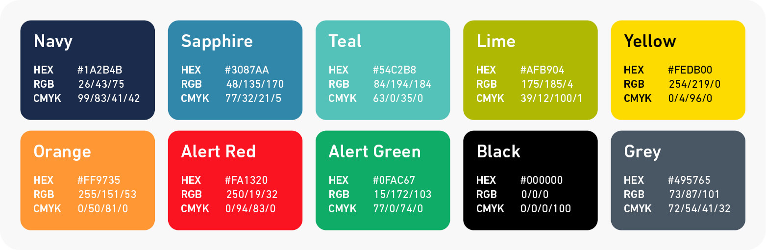
The Tertiary palette is designed to extend the range of our primary and support palettes. It is primarily used for data visualisations, charts, and graphs. They should never be the dominant colour in any design.
Experian Alert Red and Alert Green have been added to the Tertiary colour palette to indicate alert states, however they can also be used in charts and graphs when additional colours are needed.
Grey is the colour we use for all body copy text on white. If your text is below 8pt you can use black to increase legibility.
For examples on how to apply the Tertiary palette, please refer to the Visualising Information guidelines.
Gradients can be used to add visual interest and versatility to designs. To maintain a clean and cohesive look use a single gradient per composition. Multiple gradients can create a cluttered and overwhelming visual experience.
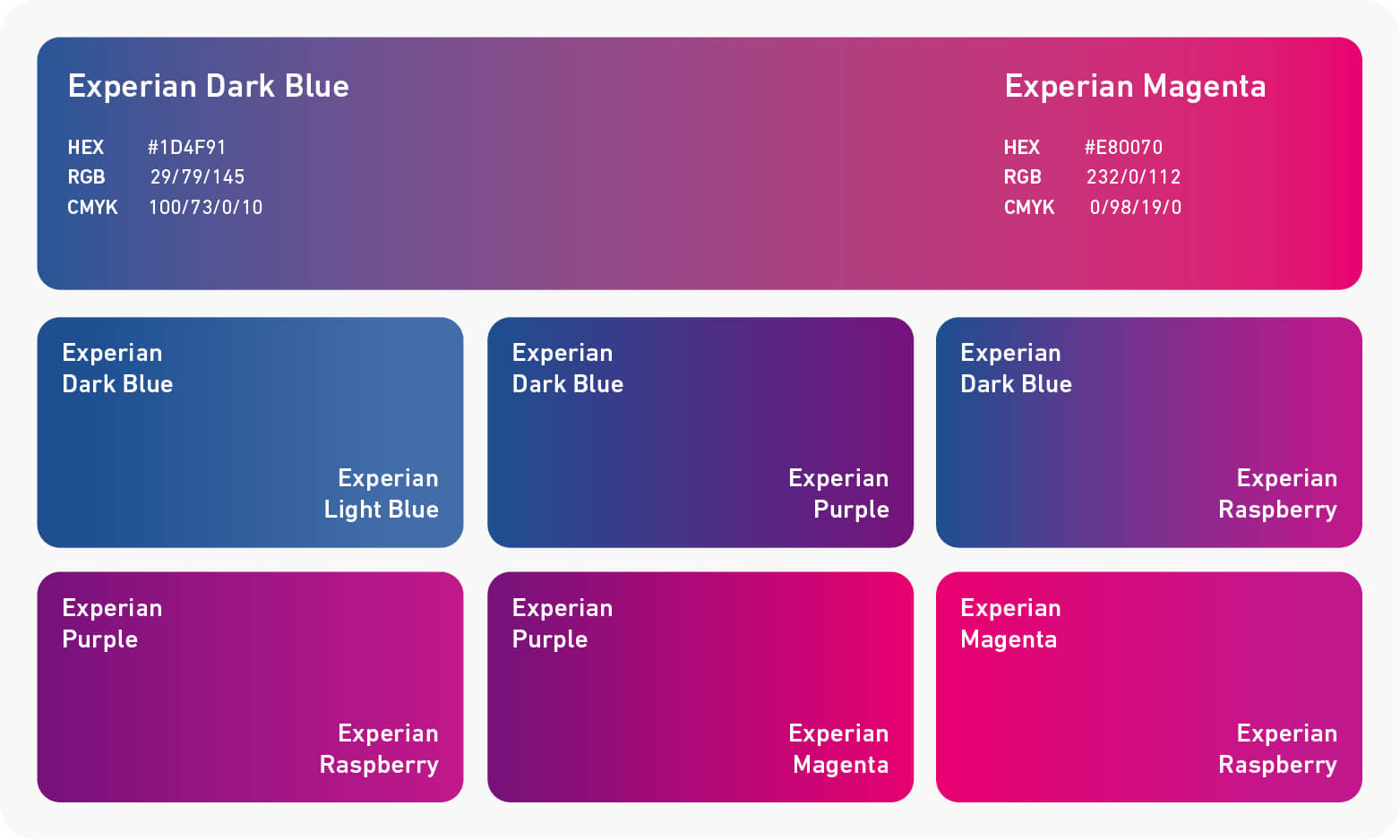
Our Primary gradient is derived from Experian Dark Blue and Experian Magenta, and should be used in the majority of instances.
Six alternative gradients are available for added flexibility, along with tonal gradients of the same colour.
The combinations below are not exhaustive. You can pair all Primary palette colours, plus grey, with white. Use Primary colours, grey, or black text on support palette colours 10 and 20. Only use black text on support palette colours 30 and above.
Do not use Primary coloured text on Primary coloured backgrounds. Do not use Support palette colours for text. Do not use white text on Support palette colours.

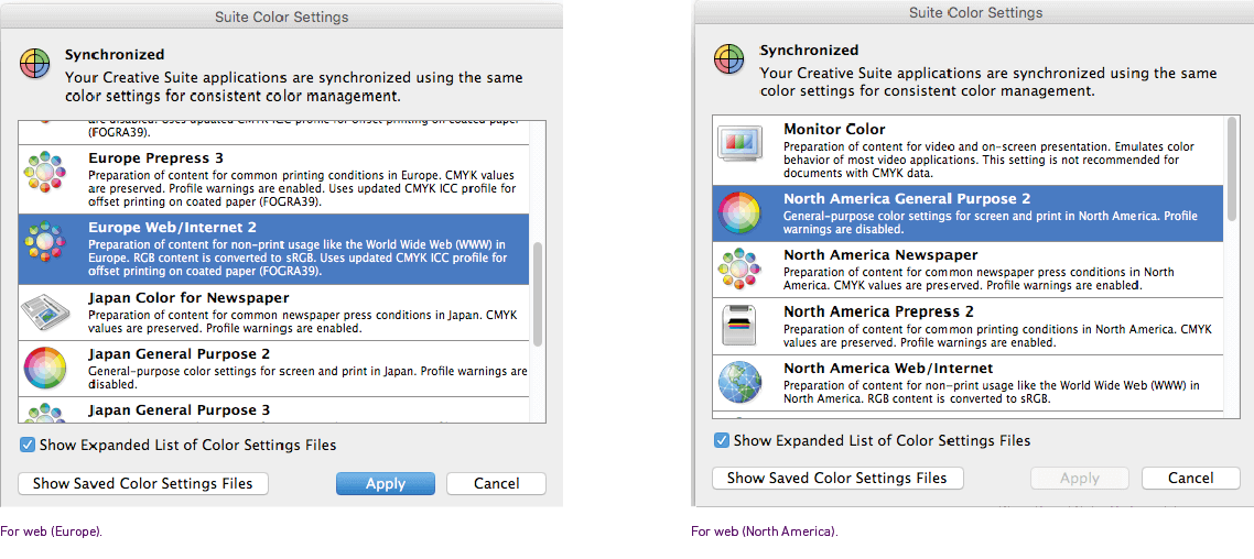
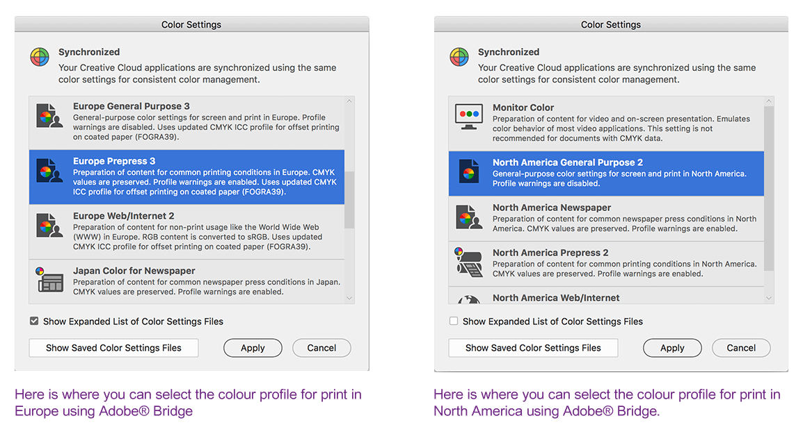
Note to professional designers and artworkers producing print materials:
It is important to begin your print project with the correct colour profile so our brand colours will look accurate.
Note to designers and artworkers producing web materials:
For all colours print and web, please use the listed values as opposed to sampling from this website.