Events and trade shows guidelines
If you require any clarification on any of the points raised on this page, please contact us.
Overview
Events and exhibition/trade shows offer an important platform to communicate the meaning and intent of our brand message and will drive global brand recognition and differentiation for Experian now and in the future.
Design and theming concepts
An event’s visual design concept should include the same key brand assets as for any Experian application.
This should include:
- Experian logo
- DIN Next font
- Imagery being used as a subtle visual metaphor for the event theme (if the event has a theme/tag line) and always in the primary style
- Primary and support colours (not tertiary)
The following elements can also be included, when appropriate:
- Icons that have been created in the brand style only
- Squircle framing device
One of the most important strategies for creating a cohesive and memorable event is to create a theme or a tagline. Choosing your theme/tagline is critical because it provides the centrepiece idea on which the presenters will focus.
An effective theme/tagline will transmit the event’s personality, mission and promise. It should capture the essence of your event, support its objectives and help communicate it in a simple and direct way.
Themes/taglines should always be in the brand voice. Details of this can be found in our brand voice section .
It is best to avoid using "Create a better tomorrow" and "Powering opportunities" as tag lines as this is our brand positioning. If somoene requests to use this for an event or trade show, it will need to be approved by the brand team. However, inspiration for tag lines can be pulled from our brand positioning.

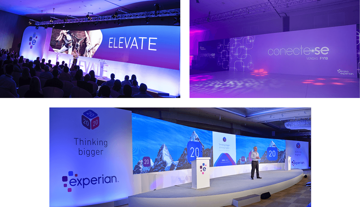
AV production for conferences and exhibitions/trade shows
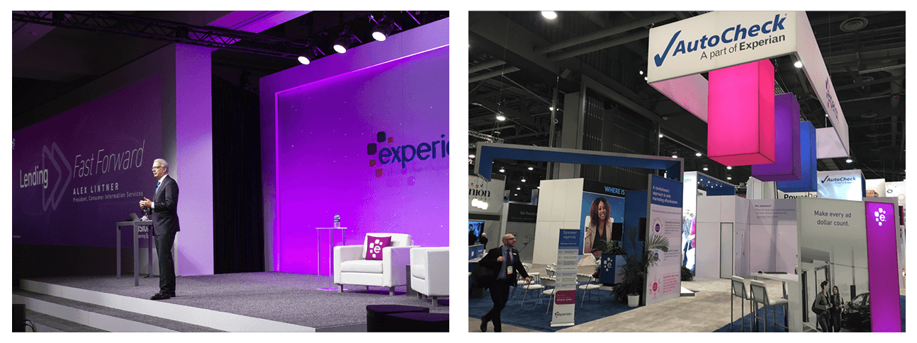
We consider conference production sets and large exhibition stands a primary face of applications. As such, we recommend the following:
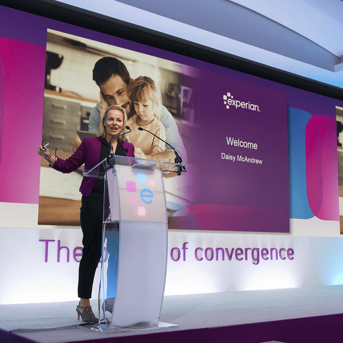
Whether printed on flats or digitally displayed (plasma screens/LED walls), the branding should always:
- Have an overall visual style that's optimistic and confident.
- Include the Experian logo, using the full logo as the primary visual logo and only the abbreviated logo in accent pieces.
- Include DIN Next font.
- If photography is included, primary style photography should be used.
- If photography is displayed on the set behind internal presenters, primary style photography should be featured whenever possible.
- If photography is displayed on the set behind prominent external keynote presenters, brand images and art should be used when possible. Some situations may require flexibility, depending on the speaker’s contracted needs.
- If incorporating data art, refer to the best practice guidelines for proper usage. Note: data art isn't meant to be used as a stamp or as another logo/main brand identifier, but it should be used to convey transformation of data and information.
- Include accents of the primary colour palette along with the support colours (not the tertiary colours).
- The overall look and feel shouldn't be too dark or busy.
- Any time cameras are used to project tight shots of the stage, logos should be placed thoughtfully (i.e., try and avoid logos being cut off or complete loss of logos, if possible).
- When using a lectern on stage, the logo should be displayed, if possible.
The set/exhibition stand could include the following:
- Printed squircles to hold photography, flat colour or text.
- Squircles can be used as a design effect but shouldn't distract from the event's overall theme.
- Elements of the set/exhibition stand could be shaped as a squircle for maximum impact — see the squircles section for more details.
- The gradient bar is a support element and shouldn't be overused or used as the dominant graphic in a layout or design. Please refer to the colour section for gradient best practices.
- Icons that have been created in the brand style only. Icons shouldn't be overused or used at random.
Fascias/carpets for stages should be as close as possible to the primary and support brand colours (not tertiary) — this can include grey or white to ensure the overall look feels crisp.
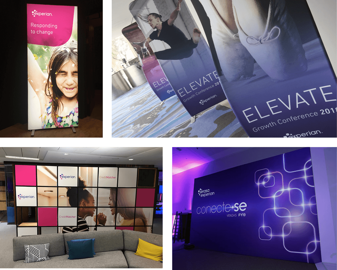
The guidelines for large exhibition stands apply to smaller exhibition stands, with the caveat that not all brand elements would be/could be used due to restriction on space. The one element which should always be featured is the full brand mark, following the brand guidelines in terms of display, colour and positioning — full details can be found in the brand mark section.
The abbreviated brand mark should only be used as a secondary logo in booths 6m X 6m or larger. For booths smaller than 6m X 6m, only the full brand mark should be applied.
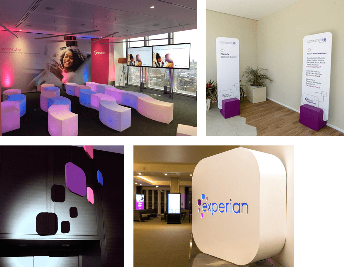
If the sets or exhibition stands include furniture, every effort should be made to match the furniture to the brand visual identity, (e.g., use a lot of white and contemporary furniture).
If bespoke furniture is built, we would recommend playing with the brand assets (for example, building stools and mats in the shape of squircles, benches or shelves in the gradient bar colour). Carpets should complement the stand with the colours matched as closely as possible to the primary and support colour palette.
For printed materials on display, always use bespoke on brand or already approved marketing collateral.
If building new bespoke demo pods, we again recommend playing with the brand assets.
If branding is possible on lecterns, it should include the Experian brand mark (or abbreviated brand mark) versus any other brand elements.
If possible, lighting (spotlighting, uplighters, gobos etc.) should be as close to the primary and support colour palette as possible.
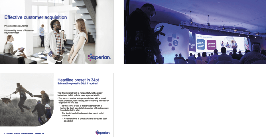
The Experian PowerPoint template should be used for all presentations. The only exception would apply to a client who's speaking at one of our events in which case they should be allowed to use their company template. Any other exceptions need to be brought to and approved by the respective region's brand leads
It would be very difficult — and too restricting — to define what style of music should be used when producing videos, for audience walk-in, speaker walk-ups or any other music used at the event.
However, we recommend that the music you choose, irrespective of its style, has an optimistic, uplifting, determined and confident mood. Don’t use pieces of music that sound dark, ominous, sad or overly reflective.
Onsite materials
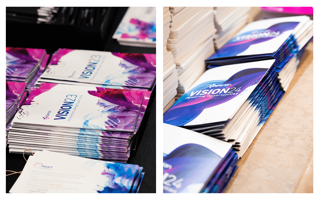
If the delegate booklet has a printable cover, the cover should include the chosen visual design concept as per the previous recommendation.
As always, DIN Next font, primary photography and primary & support colour palettes apply.
The Experian brand mark should be used thoughtfully and not excessively throughout delegate books. For external events, the full brand mark must be on the front cover and showcased thoughtfully throughout.
For internal events, the brand mark should be showcased thoughtfully but doesn't need to be on the front cover.
Ample use of white space as per any branded materials.
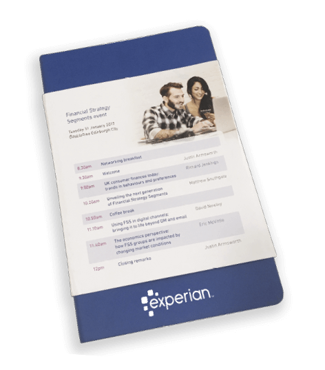
The layout is quite rigid due to the information that needs to be displayed; however, it can still be branded as follows:
Use primary and support colour palettes to fill the agenda slots.
Always include the Experian brand mark when used independently from the delegate book. More flexibility can be applied when used within the delegate book.
Follow the same recommendations for agendas, regarding the use of colour, would apply here for signage.
Logos should be at eye level and not at the foot of signs that are taller than 1.2 m.
The full or abbreviated brand mark should be used thoughtfully, using the full brand mark on any primary signs and the abbreviated brand mark for secondary signs.
- Use DIN Next font.
- Use primary and support colour palette, when possible.
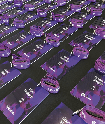
- The name should be clear and legible.
- Possibly use the squircle (rounded-corner rectangular shape) to frame the name.
- Possibly use the gradient bar.
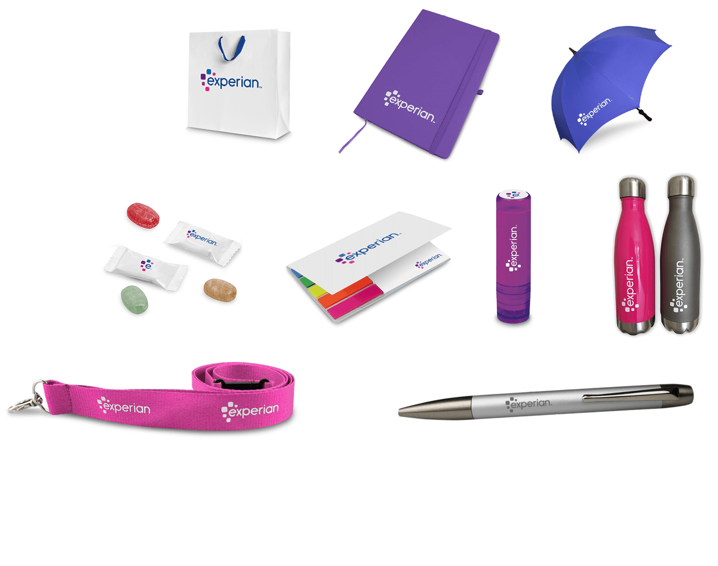
- If lanyards are provided to hold the name badges, create in primary Experian colours and include the brand mark.
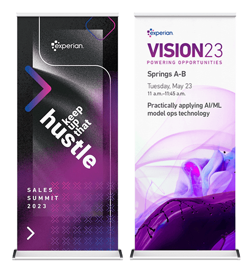
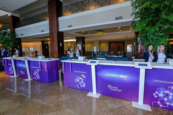
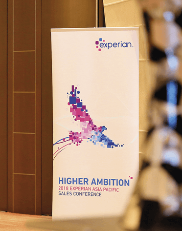
Any printed branding, such as lightboxes/graphic panels for exhibition areas/pop up banners/PVC banners, should follow the layout of the chosen design concept (adapted vertically when required) and always include the brand mark.
Flags should include the full brand mark if they're horizontal and the abbreviated form if they’re vertical.
The full or abbreviated brand mark should be used thoughtfully, using the full brand mark on any primary branded pieces and the abbreviated brand mark for secondary pieces.
For branded table throws, the full brand mark should always apply; for branded throw pillows, either the full or abbreviated brand mark is acceptable.
When events teams wear a uniform onsite, we recommend we recommend using the white Experian brand mark on black shirts.
For other branded apparel, the full brand mark should be the primary logo on the front or back. The abbreviated brand mark can be used as an accent (e.g., shirt sleeve, back collar area). Apparel should be a solid colour whenever possible, or very subtle prints.
When applying the brand mark to apparel, the full colour brand mark should be used whenever possible. When a full colour brand mark isn't possible, black or white is the only other approved colour option. Black or white tone on tone is also acceptable (i.e., black on black or white on white).
You can use either the full or abbreviated brand mark on these banners, depending on the setup/size, but strictly follow the brand mark guidelines otherwise. For example, if a vertical banner isn't wide enough to display the full brand mark, then the abbreviated version would be acceptable. However, if a choice of banners is available, you should try to use the full version. Brand marks should be at eye level and not at the foot of signs that are taller than 1.2 m.
For external events, all giveaways should showcase the full logo. For internal events, the full brand mark is preferred but the abbreviated brand mark can be used if necessary, based on the size of the item. Please make sure your merchandise provider follows all the Experian brand guidelines when producing branded giveaways.
Digital
Event microsites should follow the chosen design concept and adhere to the web guidelines.
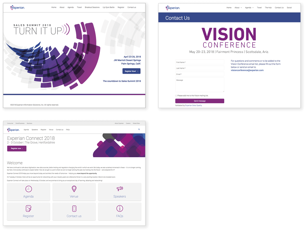
The following guidelines should apply:
Visual guidelines
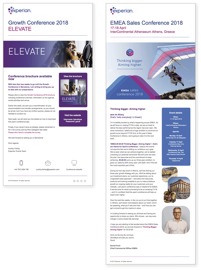
Emails should follow the chosen design concept and the email templates that have been created for your region.
Verbal guidelines
All emails and campaign materials should be in the brand voice — further details can be found in the brand voice section.
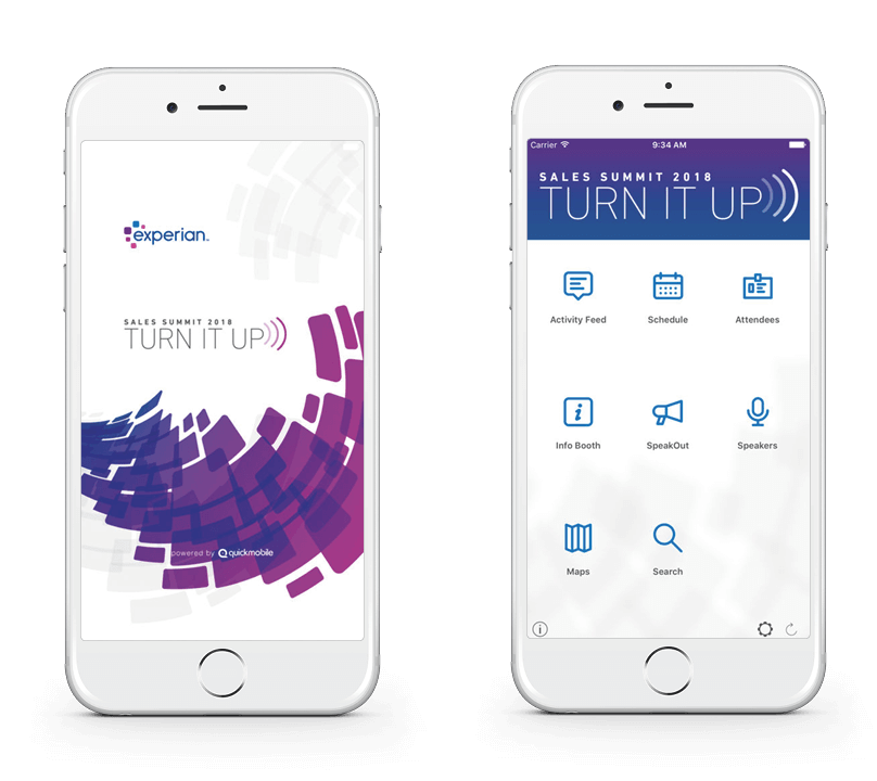
Apps should include the chosen visual design concept for the splash screen.
Ideally, our own suite of icons should be uploaded so we don’t rely on the app provider's default icon style. If this can’t be done, the icons should be in our primary and support colours.
Any banners should follow the digital guidelines for apps.
When displayed inside the main event app icon (small square), the brand mark should be in its abbreviated form.
Further considerations
There isn't a different set of guidelines for internal and external events. Events Teams need to ensure they find ways of making the events look engaging and visually impactful within the new brand guidelines whether they're internal or external, and careful thought will need to be given to events whose key objective is to motivate, such as sales conferences.
Some smaller internal events may have some flexibility in brand guidelines. For cases where an internal event may work outside of the overall brand guidelines, the brand team would need to approve.
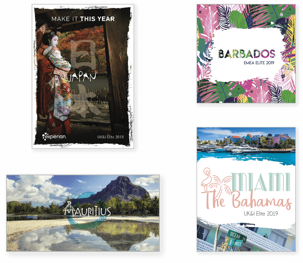
Historically, the Elite incentive campaign has never fallen under corporate brand guidelines due to the nature of the activity to highly motivate sales people to exceed targets with the aim of winning a place on the Elite trip. The Elite incentive campaign is about promoting the chosen Elite destination, hence the focus on a destination-led look and feel.
Vibrant imagery, striking fonts, bright colours, fun graphic elements all based on the destination are the Elite campaigns’ trademark and are very well received.