Visualising information
If you require any clarification on any of the points raised on this page, please contact us.
Overview
Experian is a data-driven company, and we’re constantly called upon to find interesting ways to tell a particular data story. This guide has been developed to help you organise and create engaging information stories through by using brand elements, charts and graphs, infographics, and animation. You may use the examples on this page, or you can come up with your own way to tell an information story. The guide is designed to help the creative process while staying true to our brand identity. The Experian brand offers a broad range of colours, elements and design tools; this page is here to show you how you can use these to enhance and help evolve the brand rather than feel restrained by it.
Remember when visualising information, use the brand fonts, colours, shapes and iconography as detailed here Experian brand guidelines.
Four types of visualising information
There are numerous options available when creating visuals to enhance content. Over the next few sections, we’ll explore the most commonly used approaches and consider how our brand style can be effectively applied to each. The four primary methods of visualising information are iconography, charts and graphs, infographics, and animation.
Iconography
Icons play an important role in visualising information. They help illustrate ideas, are essential for navigation and can be used to aid in content organisation.
The Experian icons, found in the brand asset hub, are custom designed to support our brand identity. The brand icons can be used in many ways to enhance the communication of your piece such as:
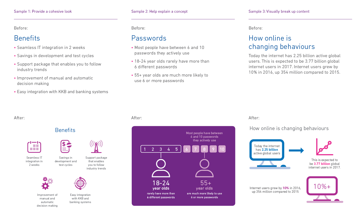
- Provide a cohesive look to a list of facts (sample 1)
- Help explain a concept or set of numbers (sample 2)
- Visually break up content (sample 3)
Design tip: Overuse of visuals is a common mistake and ends up detracting from, not supporting the document content.
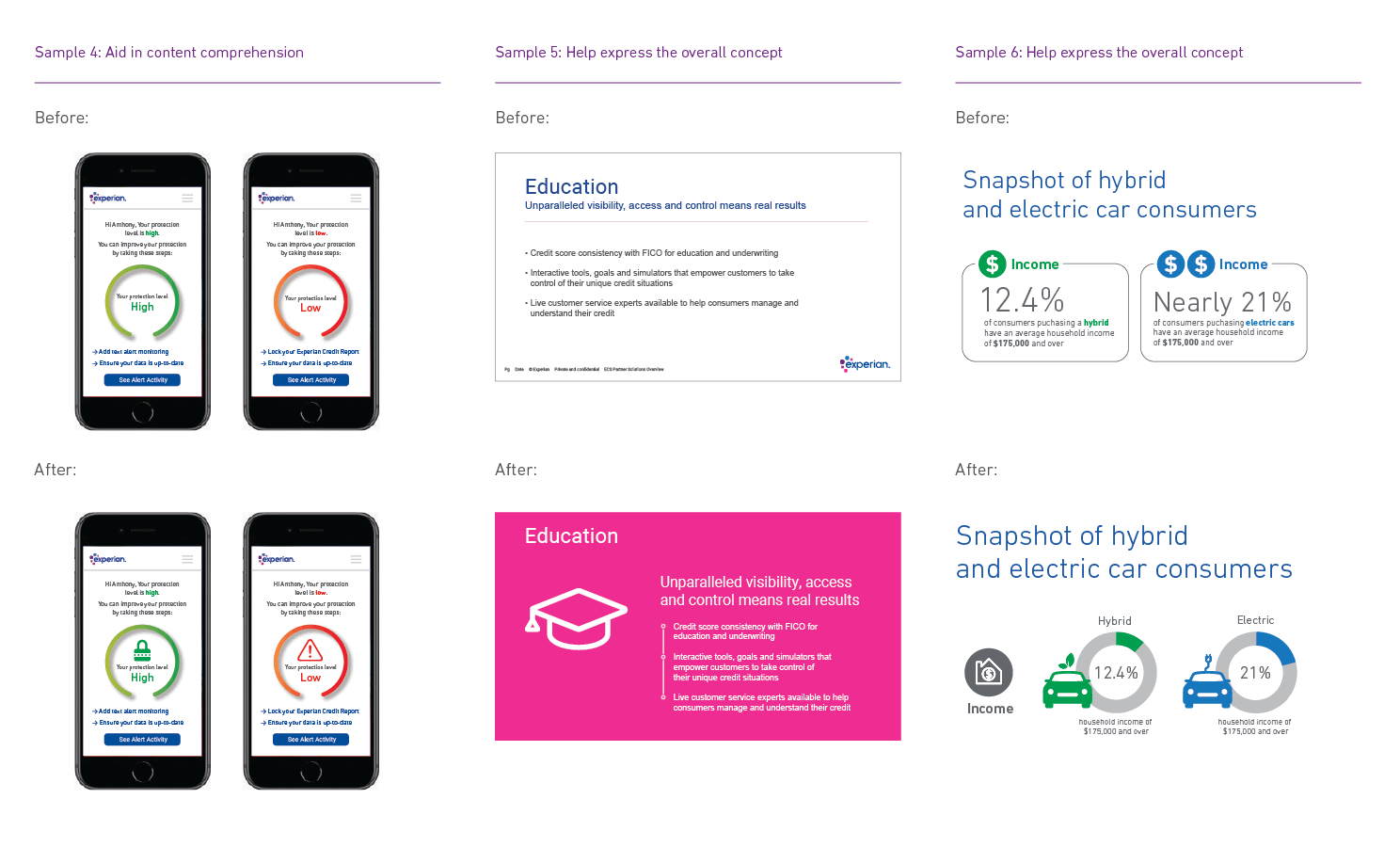
- A series of icons can help the reader remember or better understand the information being communicated (sample 4).
- A single icon can help express the overall concept of the content (samples 5–6).
There's an extensive library of icons in the Brand Asset Hub (www.experian.com/asset-hub). If you require an icon that isn't part of the icon library, a new icon can be produced using the design guidance provided in the Experian brand identity.
Design tips:
- Colour can be used very effectively to enhance communication.
- Sample 4 uses colour as an indicator.
- Green = high; red = low. Sample 5 uses colour as an organisational device.
- Sample 6 uses colour as a subject differentiator. Green = hybrid; blue = electric.
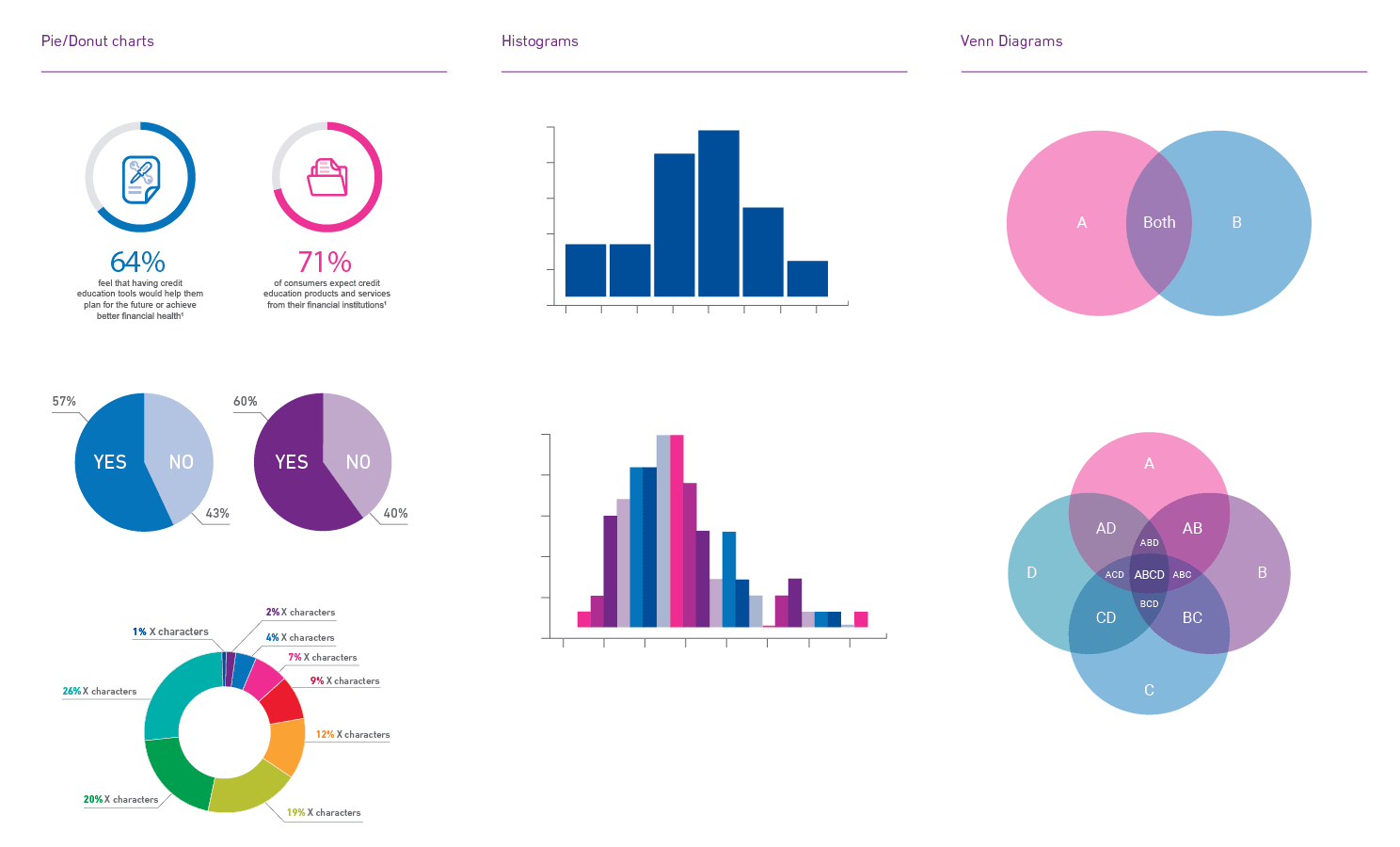
Charts and graphs
As a data-driven company, charts and graphs are a very common design element at Experian. They can also be great way to add interest and creativity to your document.
Charts and graphs are the most common way we visualise data. They can also be a great way to add interest and creativity to your document.
Here are some suggestions for what type of chart to use depending on what you want the data to communicate:
Comparison — line, bar, pie/donut
Relationships — Venn
Distribution — line, Bar, Histogram, Scatter plot
Trends — Line, histogram
- Composition — pie/donut
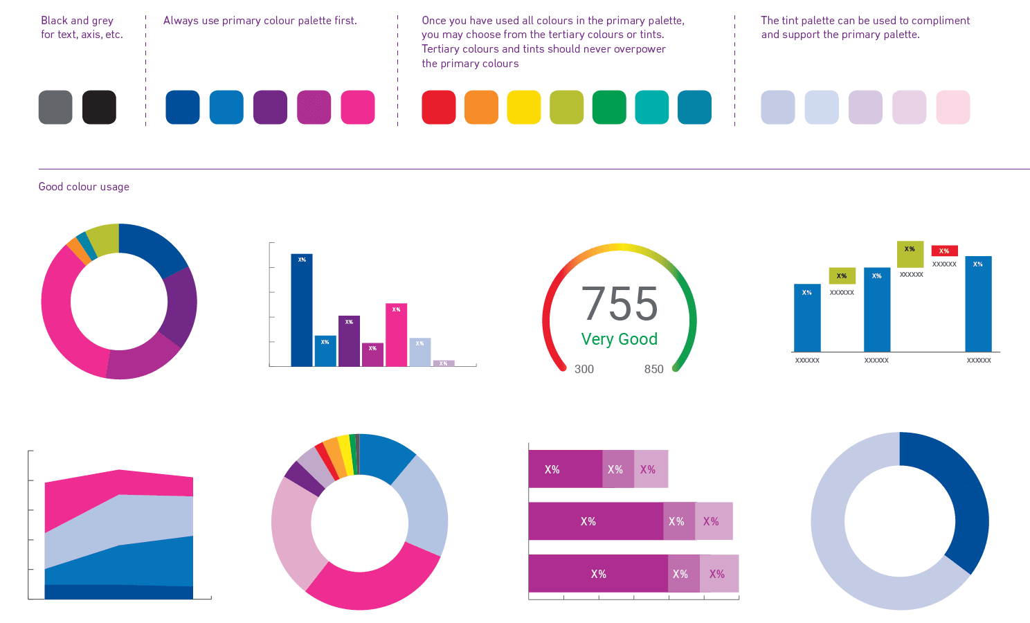
Design tip:
When choosing colours for charts, make sure they're easily differentiated from each other, but are arranged in a way so as not to detract from the cohesiveness of the document.
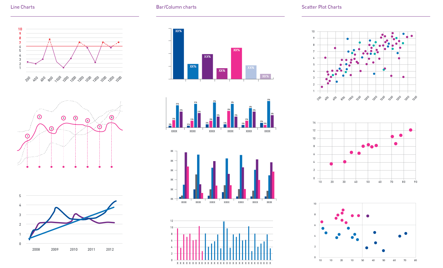
Changing chart and graph styles in the same document will naturally separate information and create a visual pause from point to point. However, when making comparisons between data, try to use the same type of chart or graph.
Design tip:
When designing, keep in mind your audience and how they might react to your choice of colour.
The use of colour in charts and graphs can clarify and enhance if done well. If done poorly, colour can confuse and obscure the information.
Because colour has such a strong asthetic quality, first evaluate whether colour is needed to enhance the communication. Depending upon the colour you’re using, you may need to use more or less to achieve a proper balance; keep in mind the content should always take priority over the colour. If you look at your document and are distracted by the colour, scale it back.
Design tip:
Experian Alert Red and Experian Alert Green are most often used to signify a positive or a negative. Be careful about using them in charts and graphs or it may create confusion.
Infographics
Infographics is a broad term used to describe any visual besides photography in a document. For the purposes of this guide, we choose to define the term infographics as the visual explanation of complex systems or ideas.
Infographics can be created in many forms to aid in the communication of complex or lengthy subject matter. Here are some of the most common.
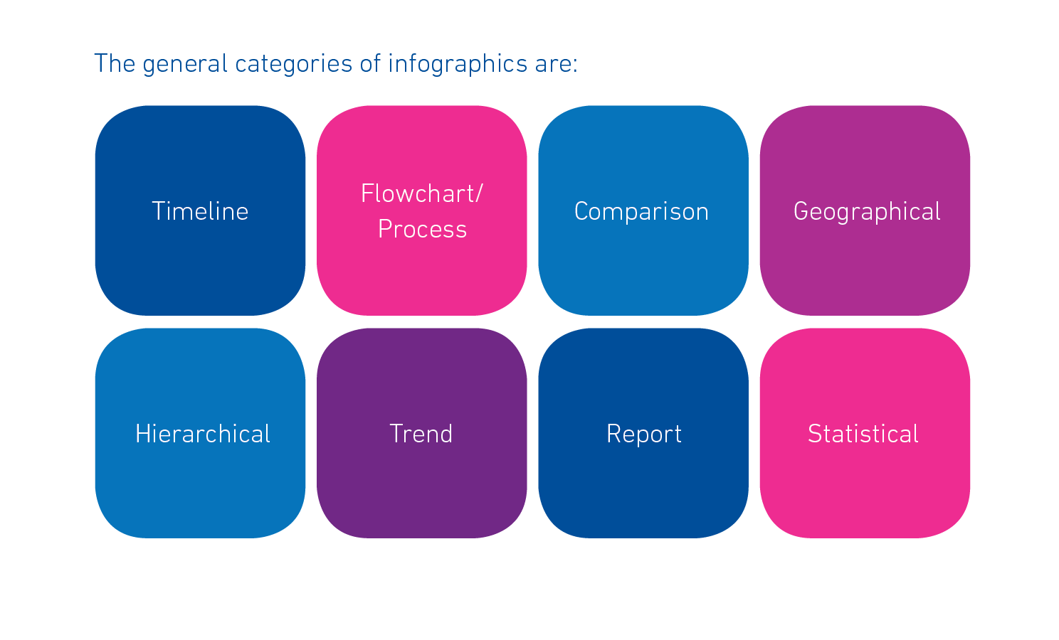
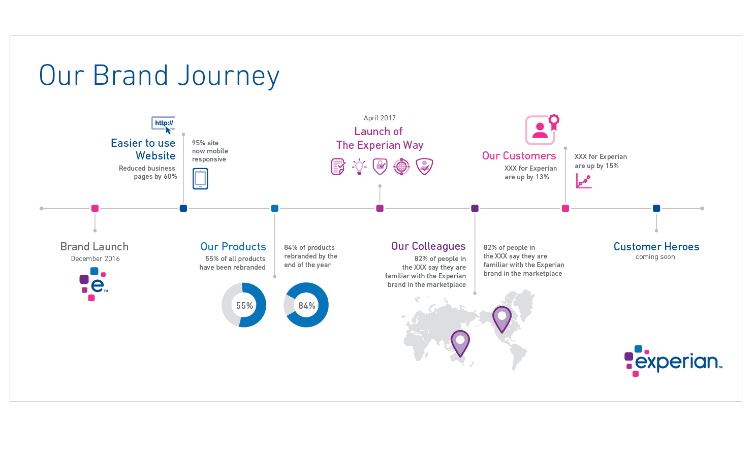
Timeline infographics map a story or process through time, using a connecting line with different points branching out.
Design tip:
Timeline infographics usually have a large amount of content. Be thoughtful about organising the information and keep enough white space so the content isn’t overwhelming.
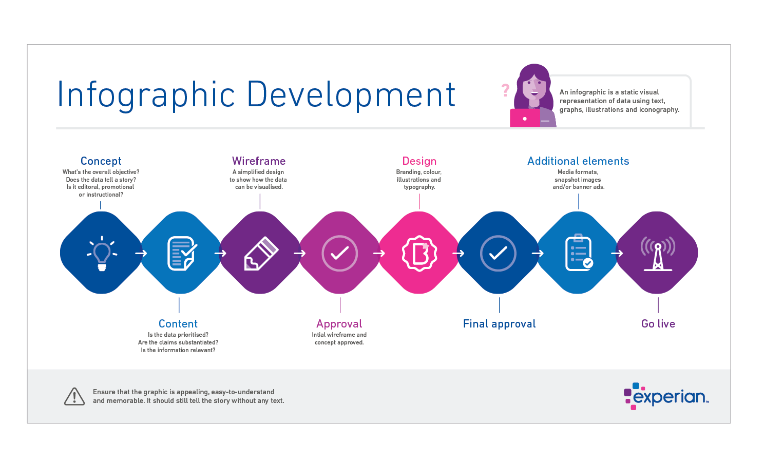
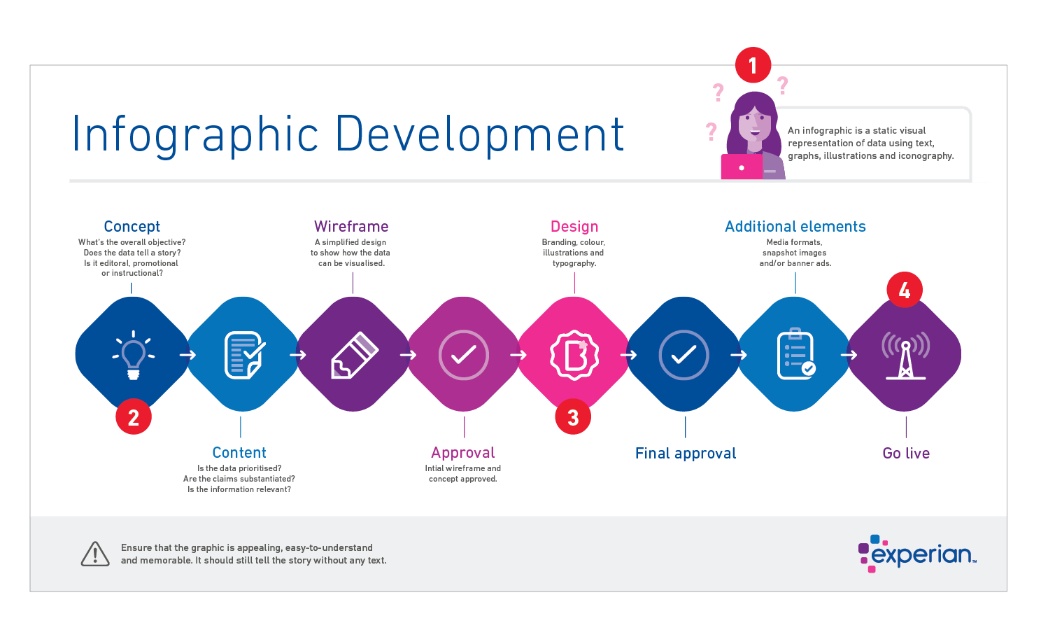
Process infographics are similar to timelines infographics in that they also show a series of points in a linear order. But process infographics specifically break down processes into a series of easy-to-follow steps.
In the example here we used icons, squircles and the primary colour palette to explain the process of creating an infographic.
Finding a balance between the copy and graphics is important for aiding communication. Our primary goal in this infographic is for the viewer to associate the icon, the colour and the step. Our secondary goal is to provide a bit more information about each step.
Design tip:
Don't use the same font weight and size throughout your entire document because it makes the subject matter difficult to read.
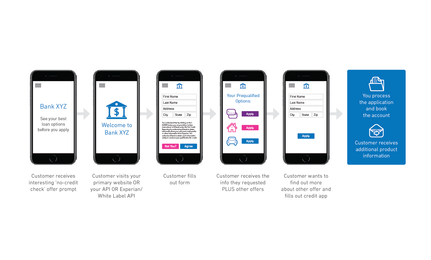
Here we use a series of mobile phone screens to show a mobile application process. In this example, we rely on icons to help guide the user. By substituting the icons for the words ‘credit card’, ‘home loan’ and ‘car loan’, we can infuse some brand personality while making it user friendly.
Design tip:
Finding a balance between the copy and graphics is important for emphasis.
Flowchart infographics are used to illustrate complex processes that could have varying outcomes at each step. It’s helpful to make flowcharts visually engaging or they tend to become overwhelming to the reader. Incorporating icons or brand elements helps add personality and interest.
Design tip:
Complicated infographics need to have a clear sense of visual hierarchy. This can be achieved through a combination of colour, font weight and type size.
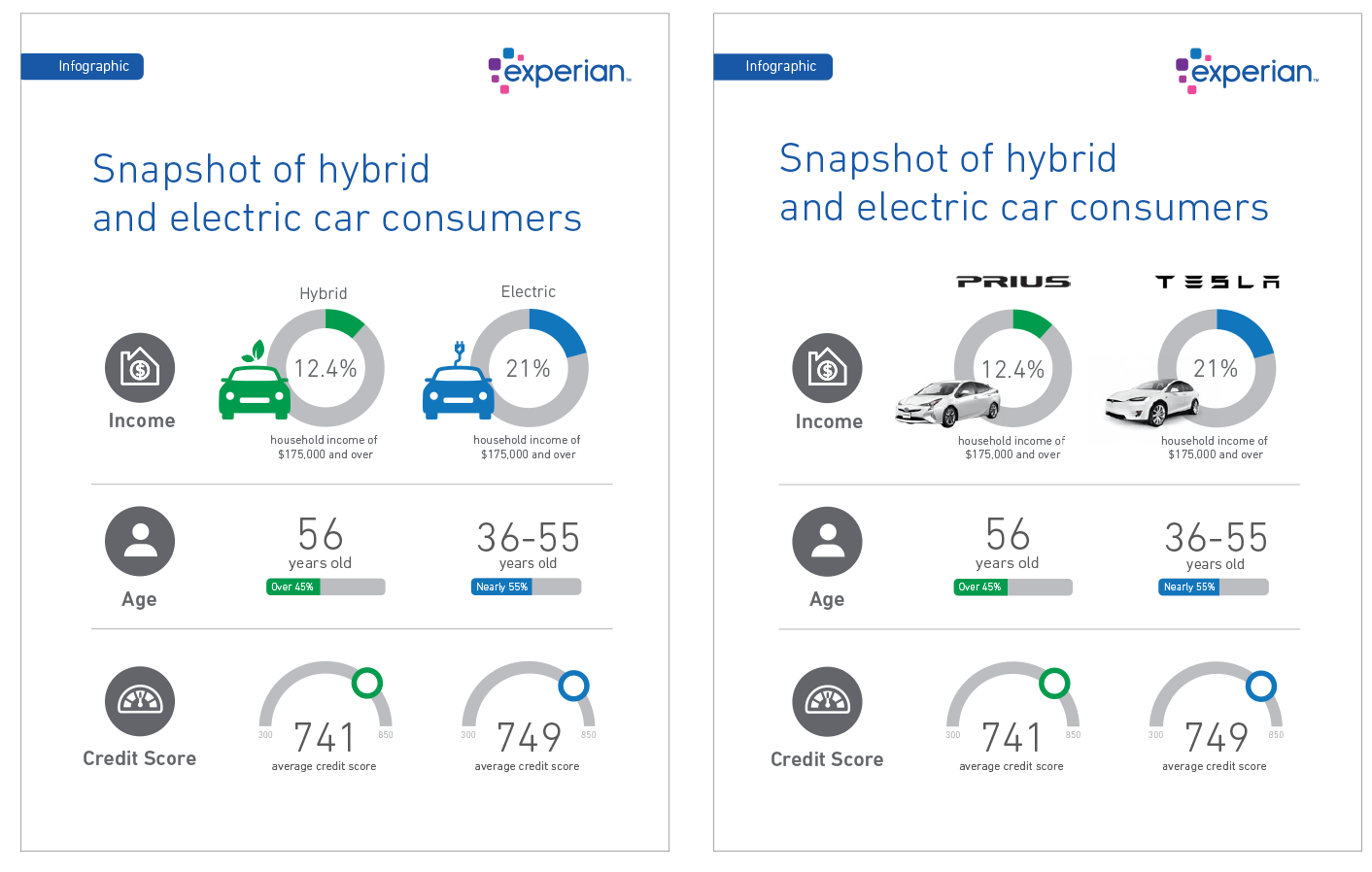
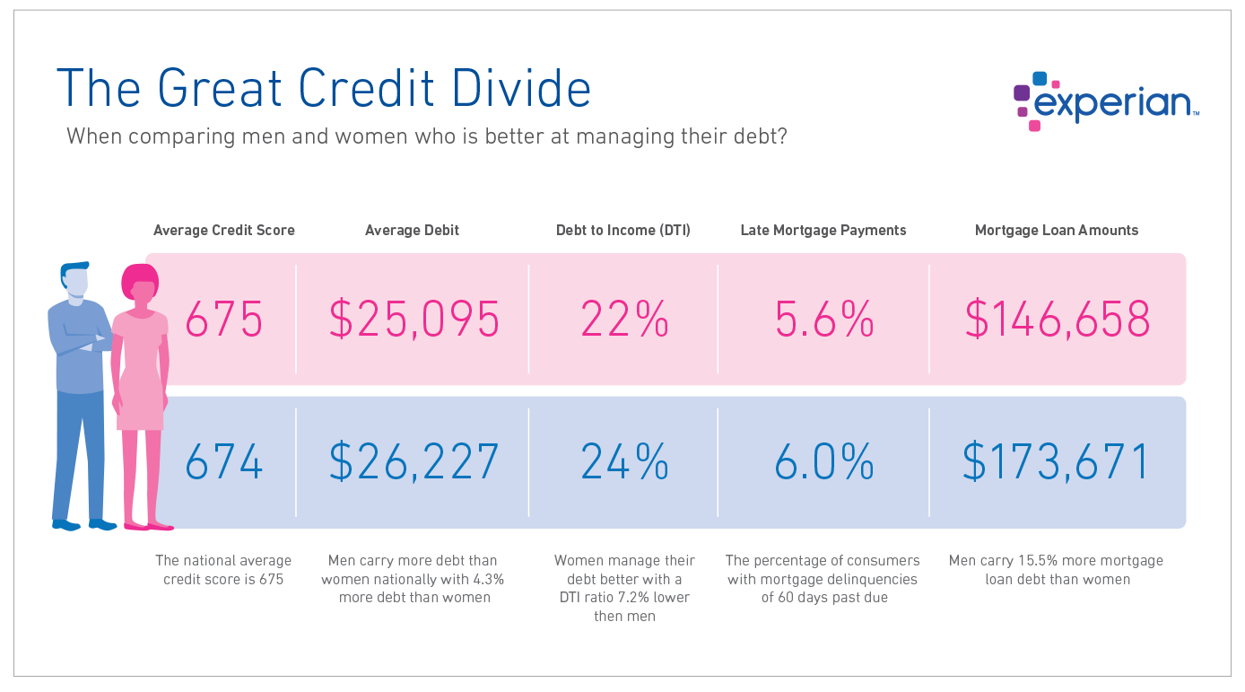
Comparison infographics highlight the differences or similarities, or pros and cons in sets of information. They can also serve as a guide for choosing between two different options.
A side-by-side layout and matching graphics help communicate we're comparing two things. Changing the chart style for each point shows there are three different topics. Colour is also used as a quick-glance technique to distinguish the two items being compared. In this case, we’re relying on a primary and a tertiary colour because they were the best match for the subject matter; however, the overall infographic is still clearly branded Experian.
Design tip:
Remember that white space isn't empty space that needs to be filled.
This comparison infographic primarily uses colour to communicate the two subjects being compared — blue = male, pink = female. Layout is also important in a comparison infographic as the items being compared should be in close proximity to each other. A long set of numbers can be broken up by adding icons or imagery, but make sure they don’t visually overpower the information being communicated. In this case, illustrations are used instead of the words ‘male’ and ‘female’.
Design tip:
Illustration and graphics should be used to enhance communication, not simply fill up space.
Geographical infographics show location-based information. Geographic information can be conveyed by highlighting or shading different parts of a map or by overlaying shapes on top of the map. A map can be the focus of data visualisation in your infographic, or it can be used to support the rest of the story.
This example uses the full colour palette in a way that doesn't overpower the information being communicated. The primary brand colours and tints are visually the most prominent. The tertiary colours are used to subdivide the content. There's also a fair amount of white space to give the content some separation. If the tertiary colors were used as solids in the map, the tertiary colors would overpower the primary colors and this graphic would not look like it’s from Experian.
Design tip:
Avoid creating ‘the rainbow effect’ by using large amounts of colour on every page.
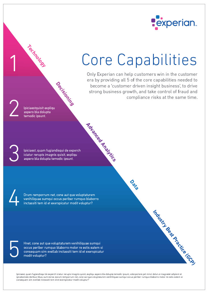
Hierarchical infographics are used to provide a quick visual reference of information importance when the data points are related to each other. This example creates clear separation and importance using the brand colours.
Design tip:
If your'e creating a long document, using strong colour should be reserved for the most important pages. If large amounts of colour are used throughout your document, its visual importance becomes diminished.
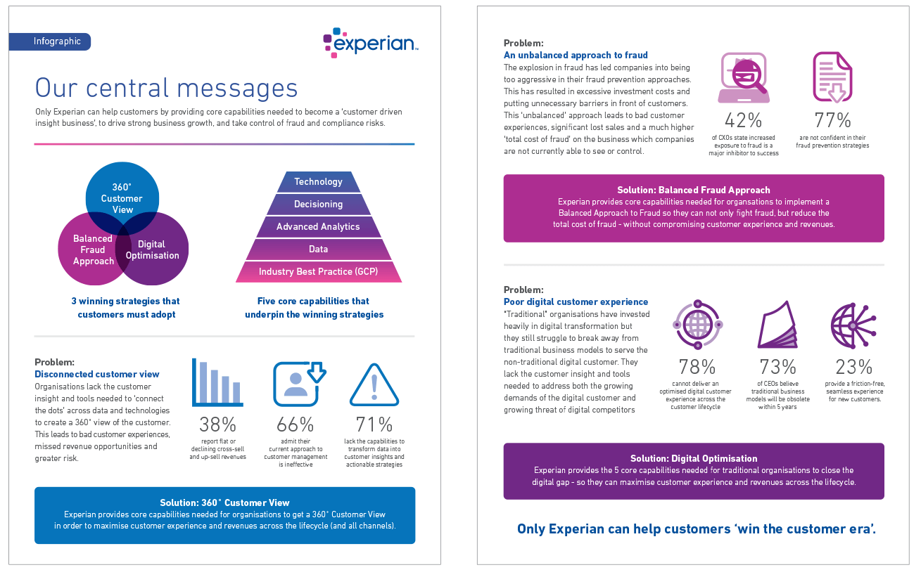
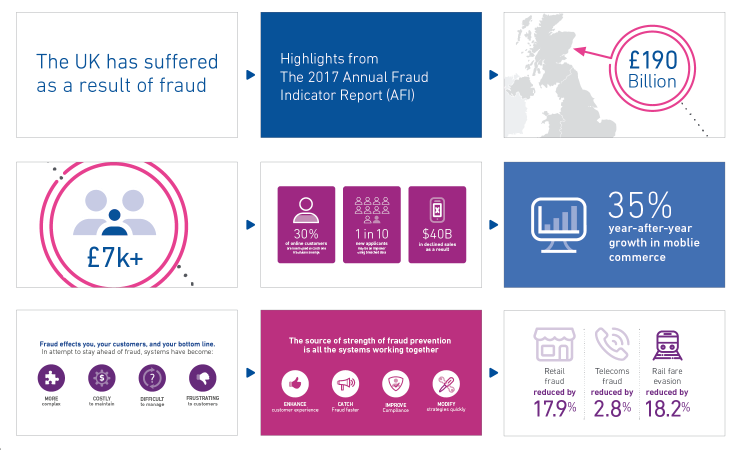
This style of infographic can also be referred to as a visualised article. This works well when you have a lot of content/data to communicate.
The illustration in the header helps communicate the subject of the article because the title alone does not.
The data points are grouped together to make sections that help to make the article more digestible. We use colour and different design styles to help differentiate the sections. Adding icons to the various statistics helps make them more engaging and visually appealing.
Design tip:
Bold colours can be balanced out with white space helping to keep the clean style of the brand.
Here we balance out a copy-heavy layout with graphics to keep the reader engaged. For added interest, we use various chart styles as well as icons. Again, colour is used to separate the sections.
Design tip:
It’s important to adapt the layout to your content and not the other way around. Do not try to force fit content into a particular format simply because you’re fond of it.
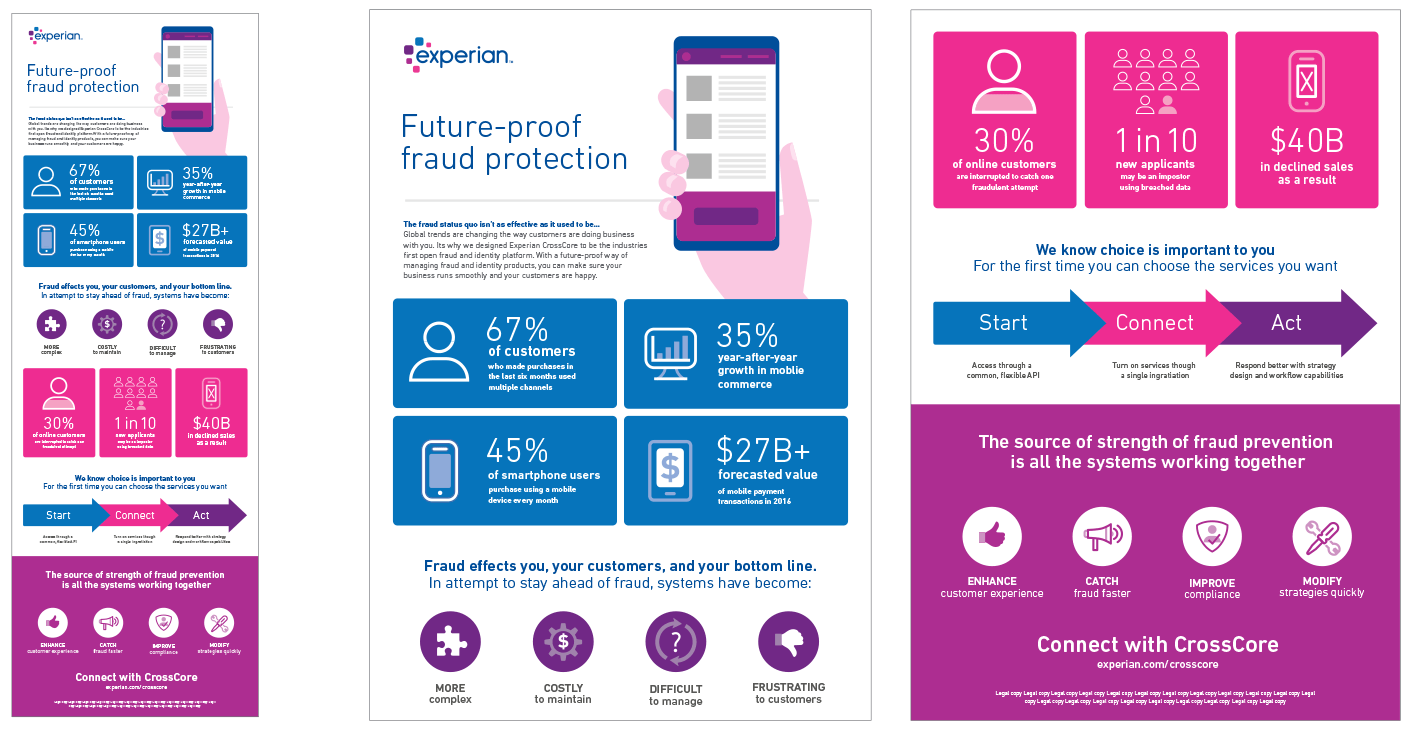
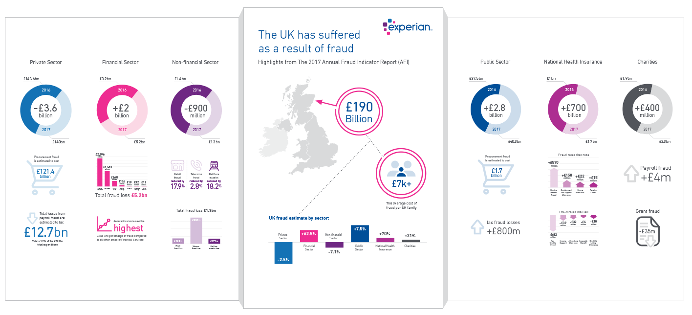
A statistical infographic should be used when you want to put the focus on your data.
This mixed chart style is a good option when you have many statistics, facts and figures to communicate to your audience.
It's important to pick the right type of chart/design to best communicate the type of data you have. Varying the chart style will also keep the viewer engaged.
Design tip:
Be sure to keep the focus on your data.
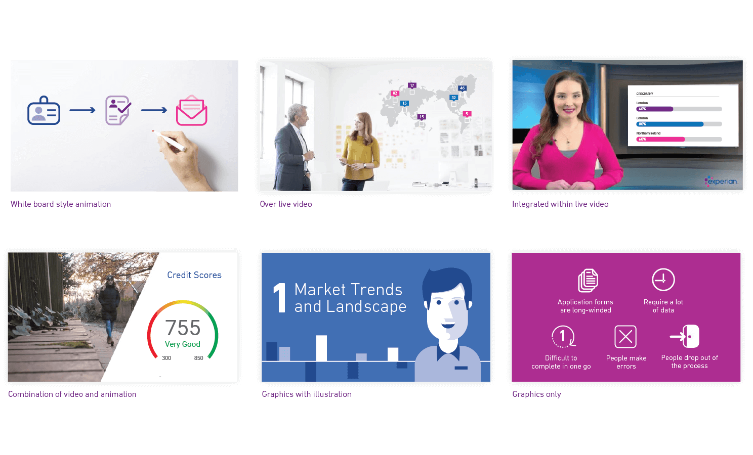
Animation
Whether through GIFs or motion graphics, enhancing your infographic with motion helps you tell your story in an engaging way.
Style overview
We aim to keep our information graphics simple and straightforward by keeping them flat, minimising the number of elements and avoiding the use of unnecessary special effects.
Using builds can add interest to the story the infographics are communicating.
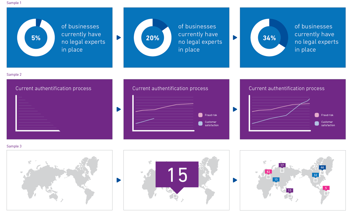
Sample 1:
The data amount can build up numerically within a pie, donut or line chart ending at the correct statistical number. This technique is useful in showing the differences between comparisons or to highlight certain statistics.
Sample 2:
The chart itself can build in to add interest. Charts with different data points can animate in one by one to highlight each data point.
Sample 3:
For geographical charts, highlighting graphics can pop in over your map, or you can zoom into areas you want to feature.
In this animated GIF, we take an existing infographic and add simple animations to the icons to add interest.
Pick just a handful of elements to animate, not everything.
The question marks move around
The lightbulb turns on and off
The star spins on branding icon
Waves radiate in and out on the tower
Motion graphics are a great way to take an in-depth and complicated infographic and break it down.
Motion graphics allow you to combine several elements — such as typography, graphics, illustration or images — that you animate, or move, to tell your story.
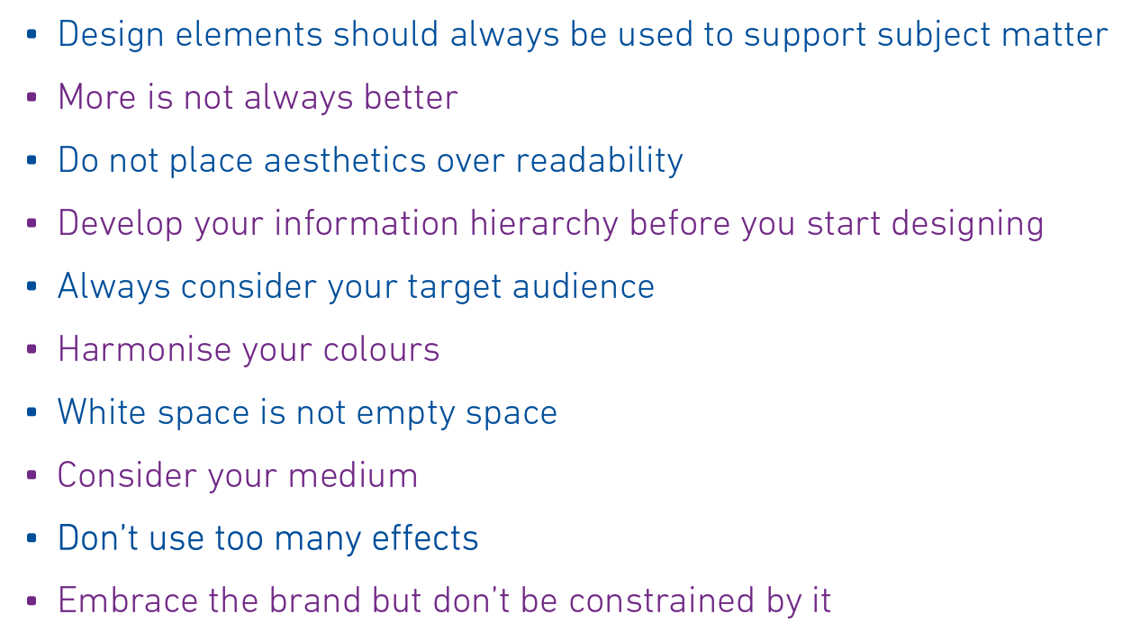
Try to use the best practices listed here to ensure your infographics are effective and true to the Experian brand.
- Design elements should always be used to support subject matter
- More is not always better
- Do not place aesthetics over readability
- Devleop your information hierarchy before you start desiging
- Always consider your target audience
- Harmonise your colours
- White space is not empty space
- Consider your medium
- Don't use too many effects
- Embrace the brand, but don't be constrained by it