Brand migration guidelines
If you require any clarification on any of the points raised on this page, please contact us.
Introduction
The acquisition process is complicated and challenging on many levels, and even once the paperwork is signed, there's still plenty of work to do. Although difficult, it should be viewed optimistically as a new level of opportunity for both parties. Experian takes great pride in our corporate brand and belief system. We realise integrating a newly acquired company into our family takes care, commitment and clear communication.
When we acquire a company, we look to tailor the integration process to ensure that it works equally well for both parties. We understand the effects a brand migration may have on the newly acquired company and its customers, as well as the effects on the acquiring Experian business unit and employees. Therefore, our approach takes the interests of all key stakeholders into consideration.
This site is to be used a guide for the brand identity transition only; however, with any acquisition, many other factors need to be considered to determine the best overall approach.
Considerations
Before embarking on a brand transition, we need to review the steps and considerations that should be addressed at the start of the migration process.
1. From a product/capabilities standpoint, you'll need to determine where the new acquisition fits within the overall Experian brand. For example, will it migrate into a preexisting business unit and, if so, what's the brand approach currently taken in this area?
2. Review the existing equities and liabilities of the acquired brand’s products, identity (logo and visual vocabulary) and personality. Will the integration of the Experian branding be a significant change from the current brand and, if so, will a phased migration approach be required?
3. Are there contractual brand considerations built into the acquisition? For example, are we required to use the acquired company's branding for a set period?
4. Is this a global or regional product offering? If it's global, will the same brand migration strategy be required across all regions? Are there cultural or linguistical nuances in the region that need to be considered?
5. Are there market considerations that need to be considered? What's the competitive landscape? Are there future acquisitions/migrations planned that may affect the branding of this acquisition?
Define
Define the budget and resources needed for the brand migration.
Develop
Develop a clear communication strategy for the brand roll-out.
Establish
Establish a timeline, clearly detailing the steps to be taken and anticipated completion dates.
The following sections provide you with the tools for a successful brand migration. Please follow these guidelines carefully when developing any Experian communication material so that we can continue to build a strong and consistent brand.
Brand summary
We live in a world built on data; it's everywhere, forever growing in power, value and influence.
At Experian, we've always believed that data has the potential to transform lives and create a better tomorrow. To do this, data needs to be understood, interpreted and the knowledge it holds acted on.
We work tirelessly to do just this: Unlock the possibilities that data holds and help people and organisations realise the opportunities held within.
Our expertise in data, analytics and technologies means we give answers and we create coherence and clarity from complexity. We help to give our customers the power to assess, predict and to plan so they may achieve their goals and navigate their world with confidence.
Our work — at times pioneering, sometimes everyday — makes us an essential part of how we all live, a dynamic force, helping us all to keep moving forward.
We understand the responsibility that goes with what we do. We act with integrity, always. We are proud to be a business that's powering opportunities and helping to create a better tomorrow.
At Experian, our focus is data, but it's what we do with that data that matters most, and that's where our brand positioning comes in. Brand positioning comprises Experian’s:
- Brand purpose
- Brand idea
Simply put, brand positioning is how we wish our consumers, our customers and our people to perceive and experience the Experian brand.
Underpinning our brand positioning are our beliefs — founding thoughts that inspire and guide everything we do.
Brand purpose:
To create a better tomorrow by powering opportunities for consumers, our customers and our people
Brand idea:
Powering opportunities
We believe:
- Data is central to how we all live. It has the potential to transform all our lives for the better.
- We can unlock the power of data to realise opportunities for people and organisations.
- It's how we can help that sets us apart. We place the power of data and our expertise in the hands of our customers, creating opportunities and helping them plan for a better future with confidence.
- That we can make a difference to society and our communities by helping people make the most of their data.
- That how we work is as important as what we do. We treat everyone fairly and their data with respect; we work with integrity, always.
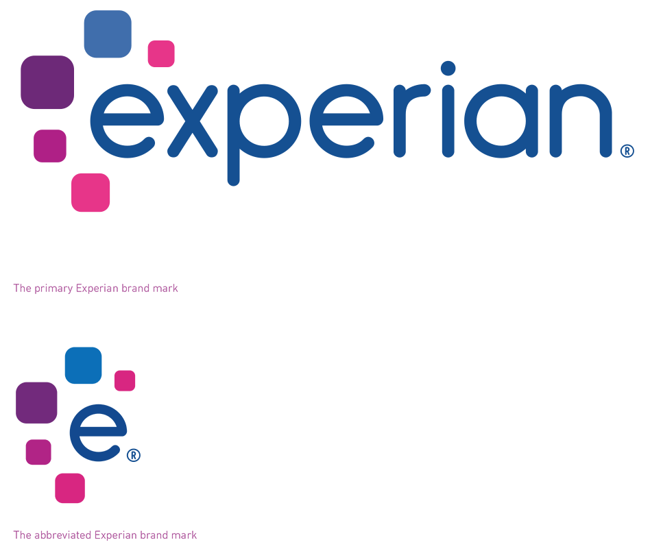
The Experian brand mark is our most important visual asset. It's our brand’s signature and embodies our brand strategy and what we stand for. The styling of the brand mark gives it a sense of fluidity, resourcefulness and optimism. It has a simplicity and elegance that feels smart and contemporary.
The tiles — squircles — radiating out around the wordmark are a representation of the opportunities that our brand creates for our customers, today and in the future.
Brand mark colours
The blues create a sense of reliability and authority. The purple and violet tones are associated with energy and optimism.
The lowercase wordmark together with the rounded letter shapes create a friendly and contemporary look and feel.
More details on the brand mark can be found in the brand mark guidelines.
The Experian visual identity — our company’s look and feel — is divided into fixed elements and flexible elements.
Fixed elements are integral to our brand. They must be used throughout our communications and should never be changed.
Flexible elements allow our brand identity to be responsive and adaptive and should be used based on specific needs and requirements of the branded material.
When migration has started, integration of core brand visual elements should begin across all internal and external communications channels. When the migration is fully complete, and the Experian brand is used independently, all visual elements should be integrated in all materials.
Please refer to the brand identity site for more information on each brand element.
Brand mark: The Experian brand mark is our brand’s signature and embodies our brand strategy and what we stand for.
Brand colours: Our brand colours give Experian materials a distinctive look and identity.
Typography: We use three typefaces:
- DIN Next as our primary brand typeface for offline materials
- Roboto as our primary brand typeface for online materials
- Arial as our system typeface
Photography:
- We capture real and authentic moments in people’s lives.
- Images should look natural and unfiltered, never staged or over edited. We focus on candid shots of people living in the moment. Our photos capture a bright and optimistic outlook, showcasing the opportunities that lie ahead.
Flexible elements include:
Icons and infographics: We use icons for navigation and to visually represent ideas.
The squircles: We use squircles — square shapes with rounded corners — to hold photography or flat colour to link our designs back to our brand mark.
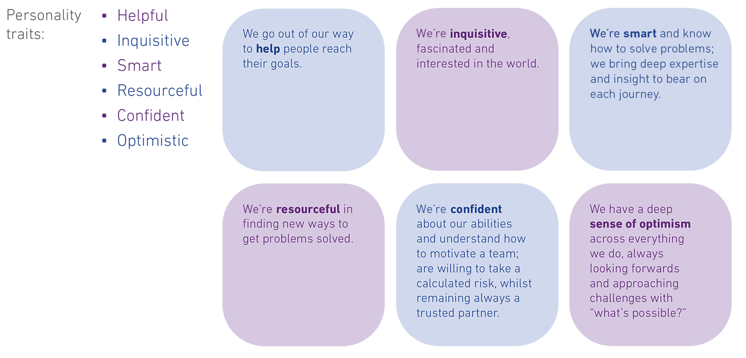
Brand personality
When audiences experience our brand, they interact with our visual and verbal brand simultaneously. Both our visual and our verbal style work hard to express our core brand idea: powering opportunities.
Our verbal identity — what we say and how we say it — helps us establish a unique, authentic and human brand personality and brand voice that are consistent across channel or platform; social media, web, internal events, videos, literature, etc.

Brand migration process
Our brand strategy guides brand migration for every company we acquire.
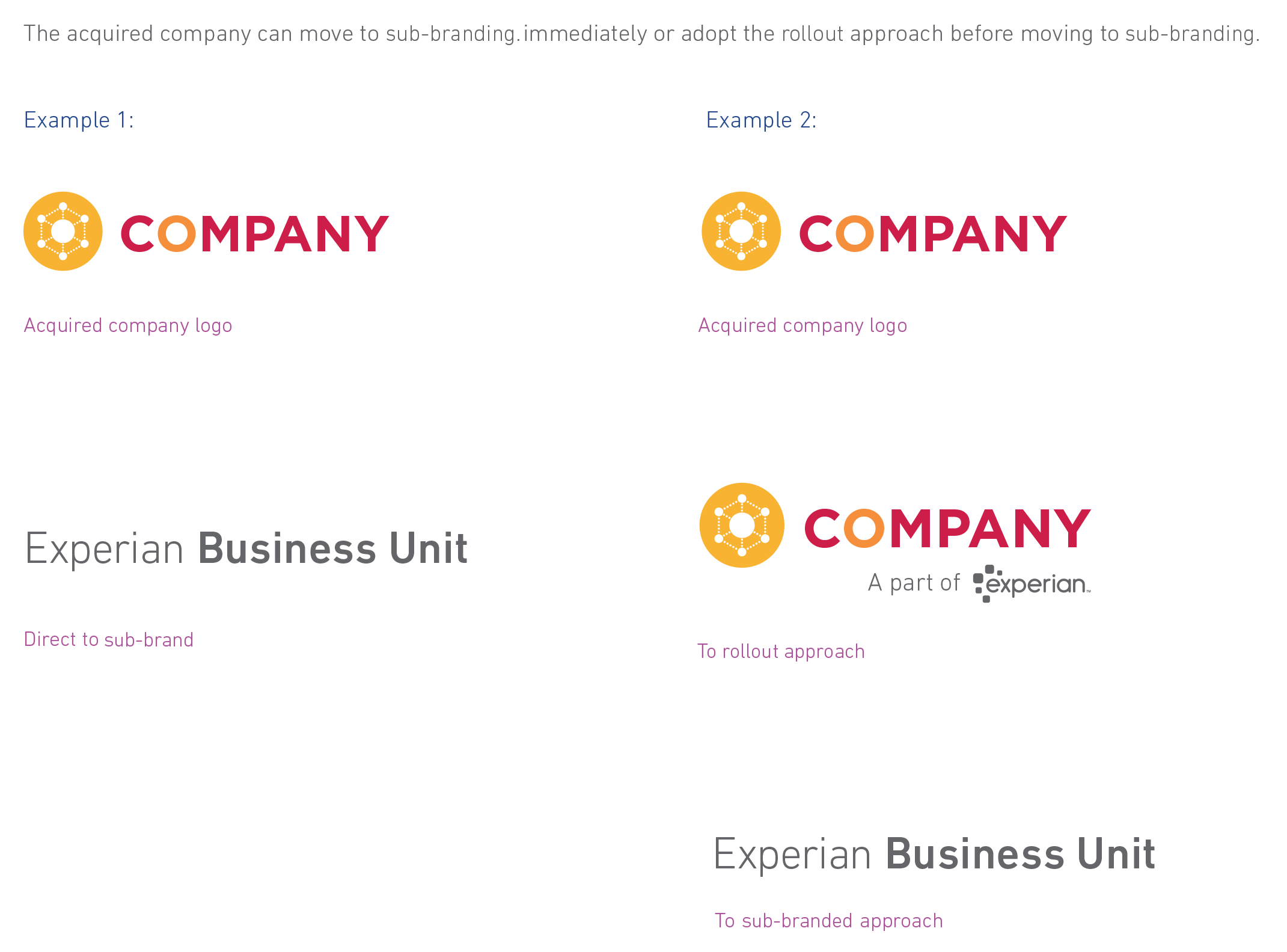
In most cases, brand identity migration is either immediate or a roll out process. However, with some acquisitions, special circumstances require more customization. In any case, we strive for the optimal approach when migrating a company and its employees to the Experian brand.
The brand team is here to provide support during your migration. If you have any questions regarding this process, please don't hesitate to contact them.
Moving directly to the Experian brand
It will be up to the migration team to determine the best brand migration approach. In circumstances where a migration rollout isn't necessary, the acquired company will begin using the Experian branding at a time agreed upon by the migration team.
Brand voice
Experian’s brand voice is adopted at the same time as the logo.
Our two-phase rollout approach raises market awareness of an ownership change before completely migrating the acquired company to the Experian brand. We begin with the acquired company’s current brand mark and brand guidelines, followed by:
Phase 1:
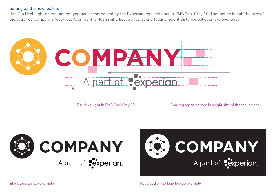
We create an Experian brand mark variation consisting of the acquired company’s brand mark, appended with 'A part of Experian'. During this phase, the acquired company should look for opportunities to begin integrating Experian’s brand guidelines.
Phase 2:
At a time to be determined by the migration team, the Experian brand mark replaces the acquired company’s brand mark. When this occurs, the acquired company should fully adopt Experian’s brand guidelines across all communication channels.
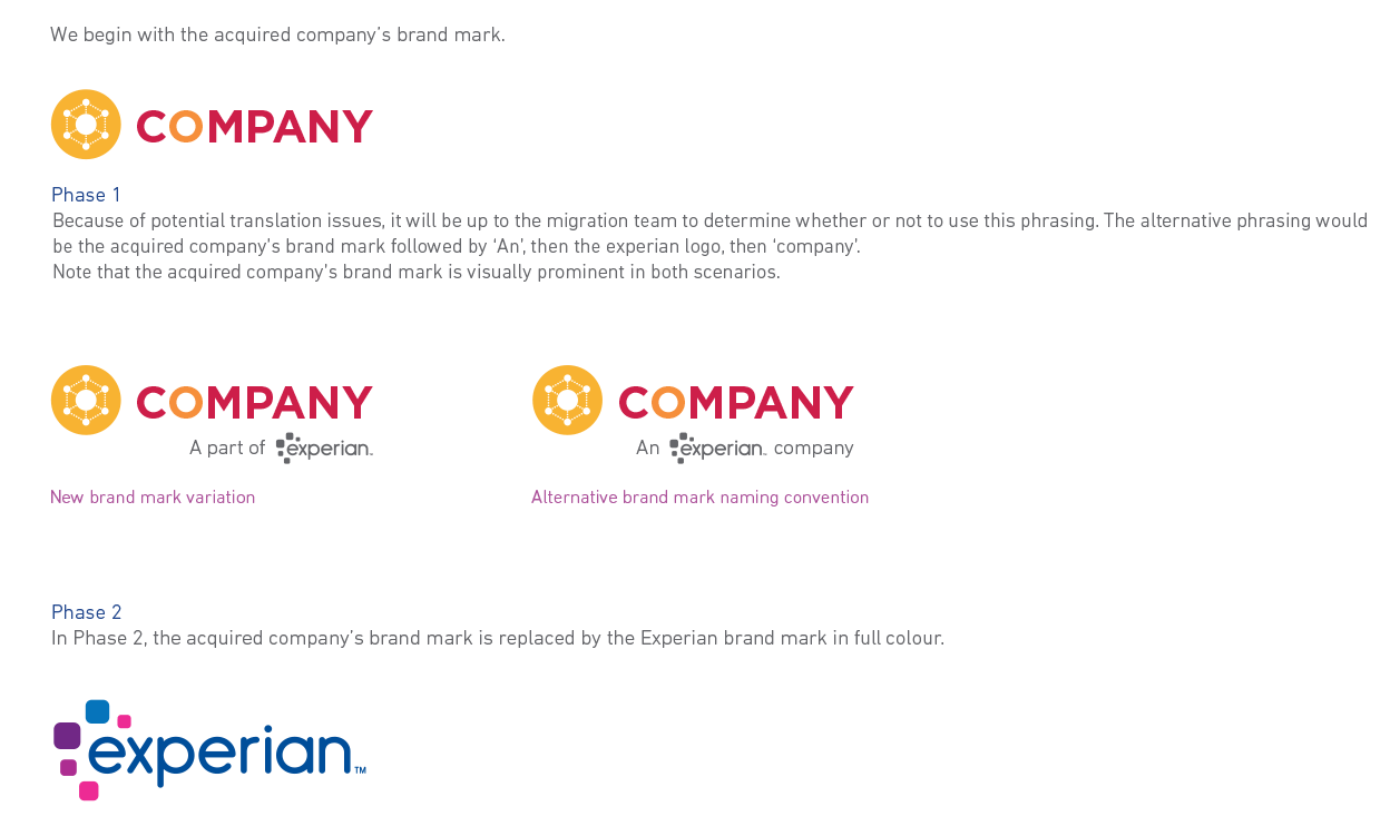
In the rollout phase, the Experian logo is always shown in one colour until the time the Experian logo replaces the acquired company logo. When the Experian logo is the primary and only logo shown, it should be shown in four colours. Details of the Experian logo can be found in the brand guidelines.
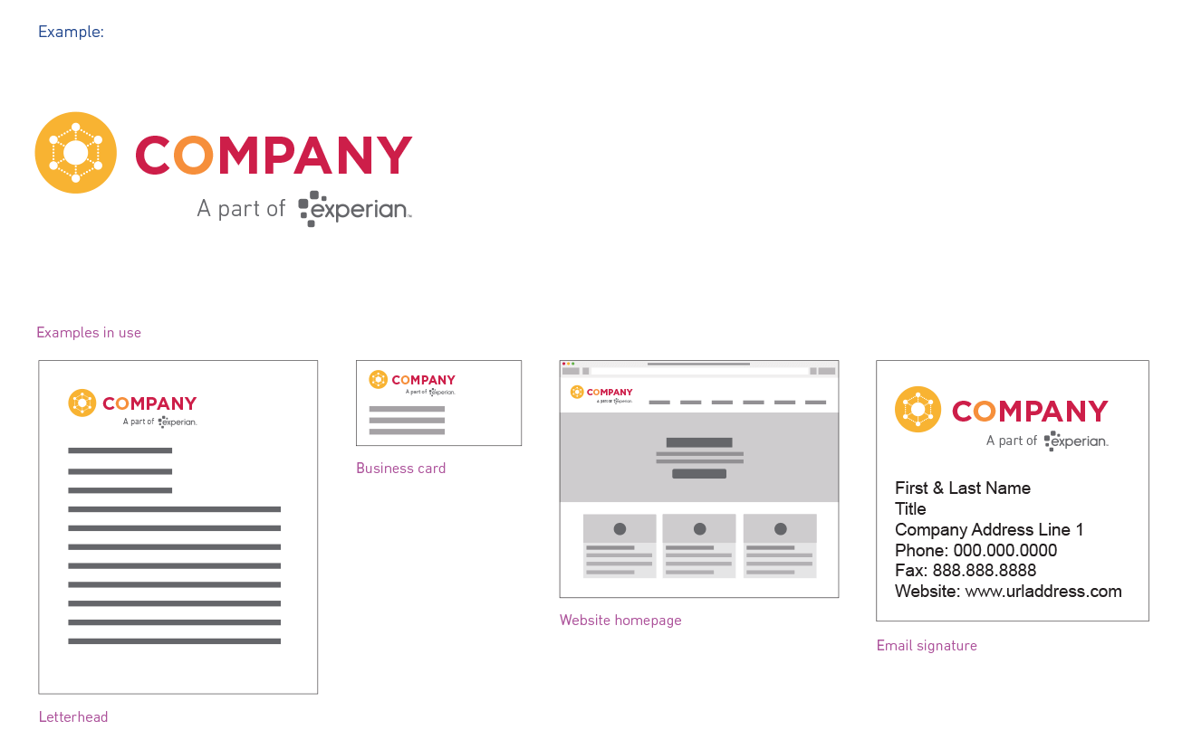
In this section, we show examples of how the rollout logo might appear on different communication materials.
Use the logo lockup whenever showing the full company logo. Continue to use the current web icon.
We realise neither the single-phase approach nor the rollout approach may be appropriate for every acquisition. In rare circumstances the sub-branded approach may be used after the rollout approach, or in place of the rollout approach.
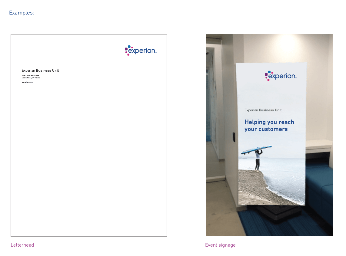
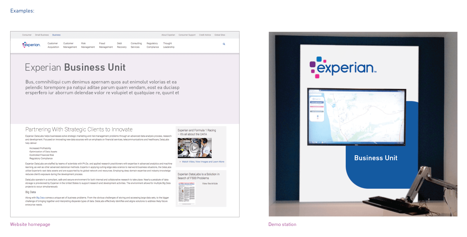
At a time established by the migration team, the acquired company adopts the Experian brand, including the Experian logo and brand voice, but is also able to use a business unit identifier. This exception will be evaluated on a case-by-case basis and will require approval from Experian’s global operations committee (OpCo).
The sub-branded business unit identifier approach is meant to be used in conjunction with the Experian logo and brand voice in circumstances where you'd like the individual BU to be identified. In most external-facing communication, the Experian logo will still be the primary brand communicator.
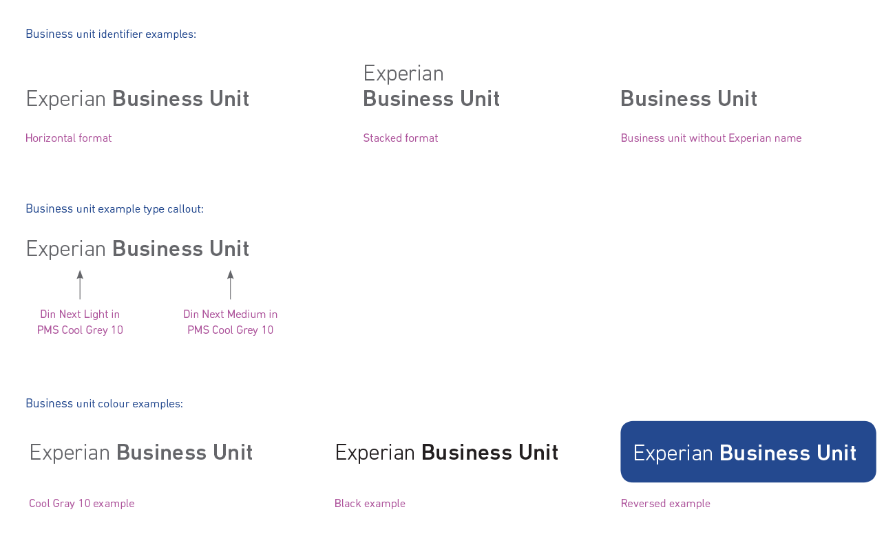
The business unit identifier is constructed using the brand font Din Next and can either include the word Experian or not. If it's to be used with Experian, it should never be the logo, just the name Experian as shown in the examples. The sub-branded BU name approach can be used without the Experian name in circumstances where Experian branding is already prominent (see sub-branded approach 4 demo station example.) The brand team will be able to assist you with the full usage guidelines if this approach is adopted.
Three brand colours have been approved for the business unit identifier — grey, black and reverse white. These are the only colours in which the BU identifier may appear.
In the next two sections, we show examples of how the business unit identifier might appear on different communication materials. You'll notice the Experian logo is never used in conjunction with, or directly next to, the business unit identifier.
The brand team will assist you in setting up this type treatment and will provide you with the guidelines on correct usage at that time.
Your integration path will be determined by the migration team at the time of the merger. However, please reach out to the Experian brand team with any questions.